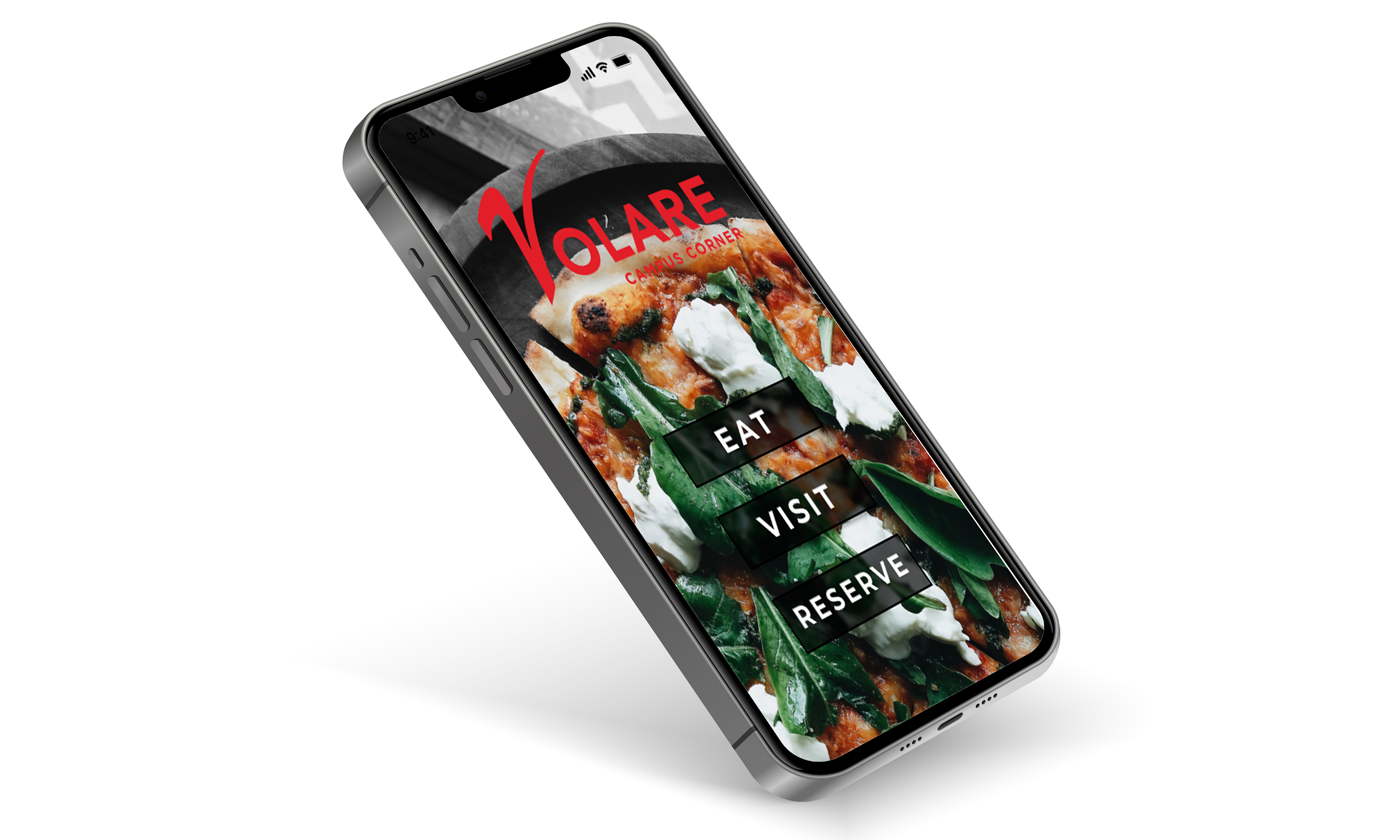

The past two weeks saw us finishing up our mobile app design. I finished the menu pages that I was working on in my last blog post and started on my location page next. I wanted it to have all the information you’d get if you clicked a search result on a map app, like hours, address and phone number, but have it more stylized and incorporated. I didn’t have a strong picture of what I wanted it to look like, so I just started adding elements I liked. One inspiration piece I found had a blur coming off the black footer at the bottom of the page, and I thought this would look nice over an image at the top. It also added another chance to show off Volare’s food.
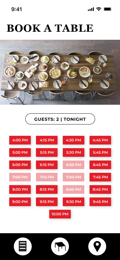
I liked the contrast between an image and a solid color block, so, I kept it when adding the map and location information. Scrolling down the page, I think this breaks up each section nicely and makes them stand out. From there, I moved on to the reservation page, where I took a lot of inspiration from reservation apps like OpenTable. I liked seeing the times available but thought it would work better for my app if they were all visible at once, with the times changing based on the party size and date.
My favorite part of this project was the prototyping. I think this process makes the whole design come together, and I love seeing elements interact the way I envisioned them in my head. It also cements the idea that your design needs to serve the app’s functionality. I started with basic connections, making sure that all my buttons went to the right places. My previous UX design project was in Adobe XD, so I enjoyed learning how Figma worked and really liked how customizable the transitions were.
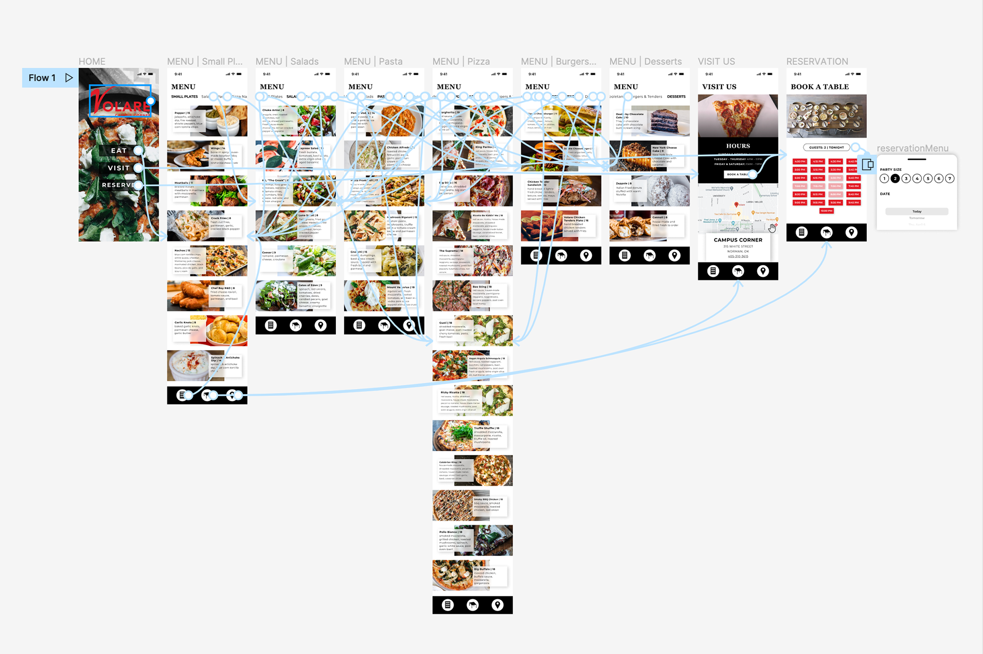
With these interactions done, I turned to the fun stuff. I wanted the navigation for the menu pages to scroll horizontally, and after a quick Google search, I added that feature. I also played around with scrolling for the map on the Visit Us page, allowing the user to move the map around. My favorite element that I added was the pop-up for the party size and date picker on the reservation page. I’m proud of how it turned out and think it goes a long way in demonstrating how the app would work. Throughout this project, I enjoyed learning more about prototyping besides the basic "clicking this takes you to that". All these little touches make the app feel real.
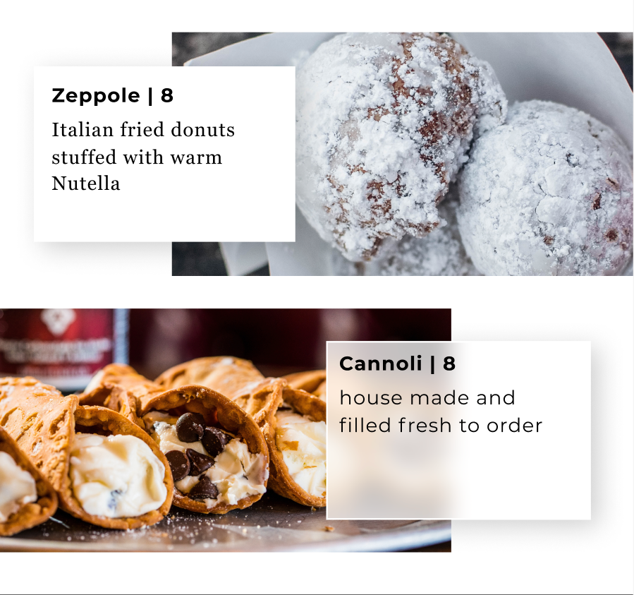
After adding all the prototyping elements I wanted, I went through my design and made minor tweaks. My initial design for the menu pages gave each item description an opaque background. However, I wanted to incorporate more of the background blur on my home screen buttons into other areas of the app, so I added it to the menu item backgrounds. I think it makes the descriptions pop more. I also changed the font to Montserrat after my professor pointed out that the font I had was a little hard to read. The new font fixes this issue and goes well with the blurred background.
This project is one of my favorites that I have done this semester. I loved doing more with user experience and designing my first mobile app. Also, using Figma for the first time was a great experience, and I am excited to do more with it and learn its potential. Overall, this project made me think about how a user/viewer interacts with my design, and I know I can take these insights with me into future projects, interactive or not.