

Over the past few weeks, we have started designing interactive projects. Our first project was creating an interactive game with a partner using the Scratch website. This was my first time using Scratch, and I thought it was a really cool tool. I’ve had some basic experience in HTML and CSS coding, and I like how Scratch made coding principles easy to visualize. Its puzzle-piece interface also made it easier to use things I was unfamiliar with. Working with a partner for this project was fun, and I think it worked best for this project because many of us weren’t very experienced with the website. It was interesting to see my partner’s approach and combine our ideas when needed. We got to bounce off each other if we got stuck.
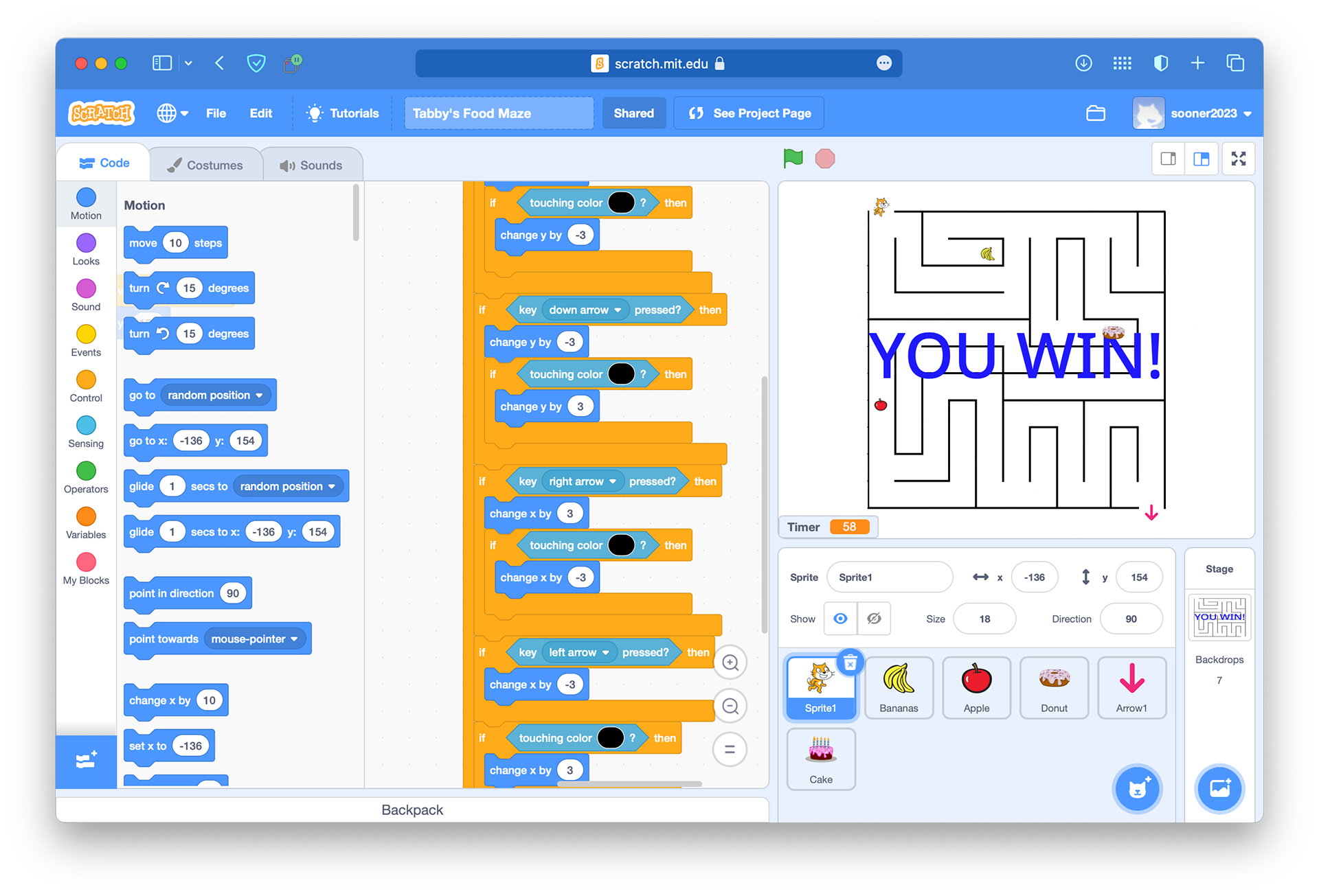
In creating our game, my partner and I focused on making our maze fun but also challenging. We kept it pretty simple, mainly because we were still learning the software ourselves. I think our biggest struggle was connecting the two levels of our game. We had to make sure the right graphics popped up at the right time and that everything reset correctly. It was a lot to think about and took quite a bit of trial and error, but in the end, I think we were able to make an engaging game. You can check it out here.
I really enjoyed the design process for this project. I love doing anything with UX/UI because it makes you think about design differently. Compared to something like an illustration or poster, I think you focus more on how the design aids the user experience. Designing with a purpose is still crucial with illustrations or posters, but it feels like interactive projects are more about designing for a purpose, and I like thinking in this way. It made me super excited to move on to our current project, in which we are designing a mobile app for a restaurant.
I decided to make my app for Volare, an Italian pizzeria and bar, because I thought it was one of the higher-end restaurants on Campus Corner and wanted to see how I could translate that feel to a mobile app. My first step was researching Volare’s brand on their social media accounts and website. Something interesting I found was that their website leans more toward the upscale, casual dining brand, while their social media seems more targeted to a younger crowd. This gave me a good starting point for how I wanted the app to look.
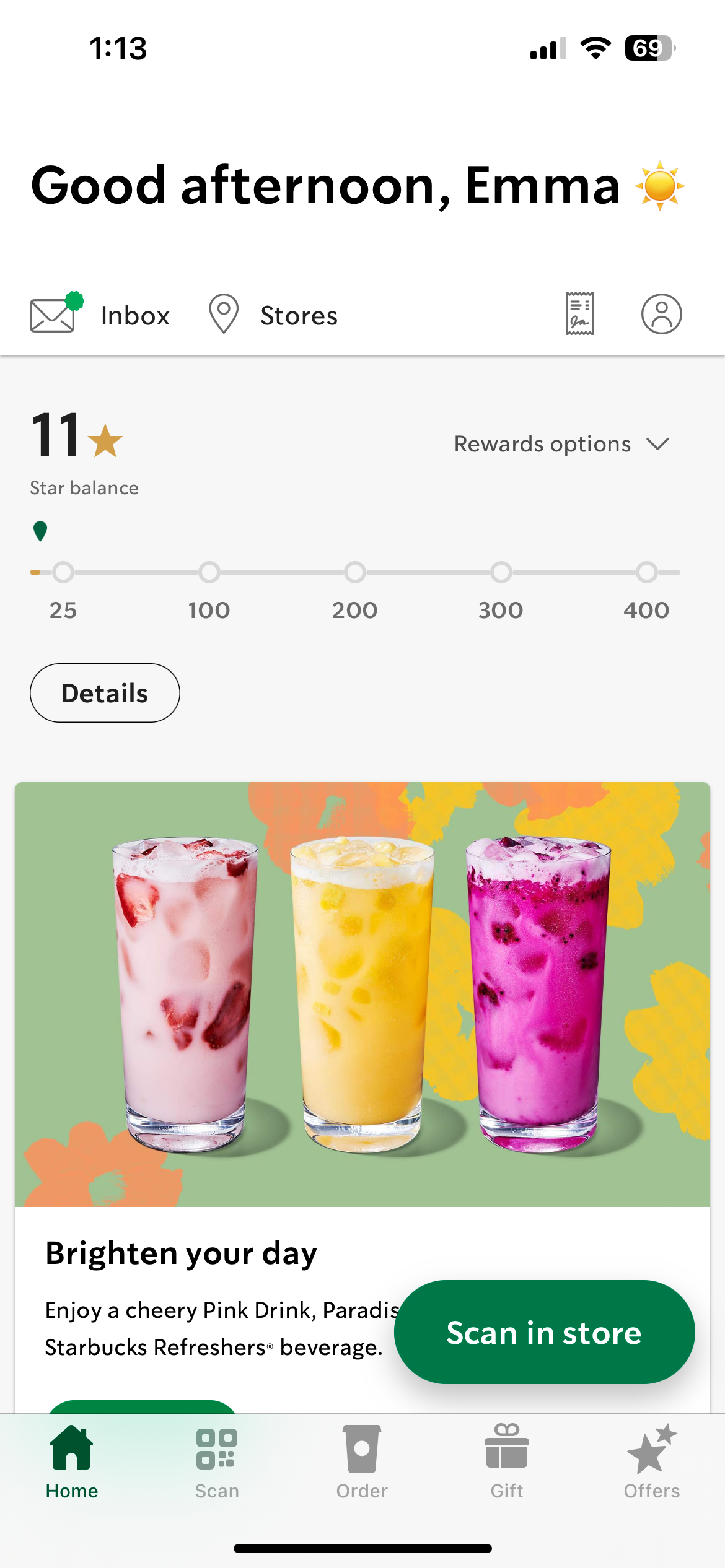
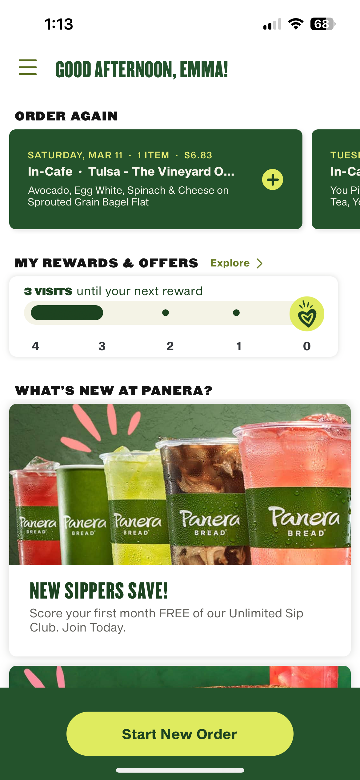
Next, I started researching mobile apps on Dribbble.com and collecting examples with elements I liked. I wanted my app to have a home, location, menu and reservation page, so I looked for different ways those functionalities were designed. Many of these shots had elements I liked, but I didn’t find much inspiration for how the app would look visually. Much of what I saw had a super modern feel that didn't match the restaurant's vibe. Then, I had the brilliant idea of pulling out my phone and looking at actual apps, wondering why I didn't start there at the beginning. Some apps that I liked the design of were Panera and Starbucks.
Right now, I have my home page done and am laying out my menu pages. So far, I have figured out how to bring in the classier vibes while keeping the app’s modern feeling. I think my font combinations and color scheme help out a lot with that. I have a few ideas for how I want my location and reservation page to look, and I am excited to work on those. Overall, I am enjoying working on this project and can’t wait to see how it all comes together, especially when I start prototyping it.