
For our final projects in my digital design class, we are designing brand activations for a streaming tv or movie. This project is unlike anything I’ve created because you’re designing an experience. Brand activations take things to a whole new level of engagement, and it’s been a little bit of a struggle for me to figure out what I was going to do. I started by researching brand activation examples. My initial idea was to design for the new Dungeons and Dragons movie, so I was specifically looking for examples from similar movies. This article helped me better understand how brands have created experiences that feel authentic to them, while this article gave me some good movie/tv show specific examples. Finding some inspiration, I started putting together an idea board. Right now, it looks like a mess because I’ve changed my mind a million times, but I just needed somewhere to collect everything I found.

My biggest struggle has been figuring out how to show my ideas. I was stuck thinking it needed to look super realistic but realized that it just needed to convey how the event would work, not be an exact replica. I looked into Adobe 3D Stager to see what I could work with, but I decided against it because I don’t have much experience with it. I also decided to switch from Dungeons & Dragons to Netflix’s Drive to Survive. I thought I would be more successful finding and creating assets for this show.
For this show, I thought it would be fun to put on a Drive to Survive Fan Festival featuring classics like live music and themed food and drinks. However, I think the ultimate fan experience would be to feel what it’s like to be part of the race. My idea was to have a team challenge with fans working together on activities like a pit stop challenge, a VR driving simulator and a race strategy exercise. This can give fans a look into all aspects of the race and plays well into the behind-the-scenes aspect of the show.
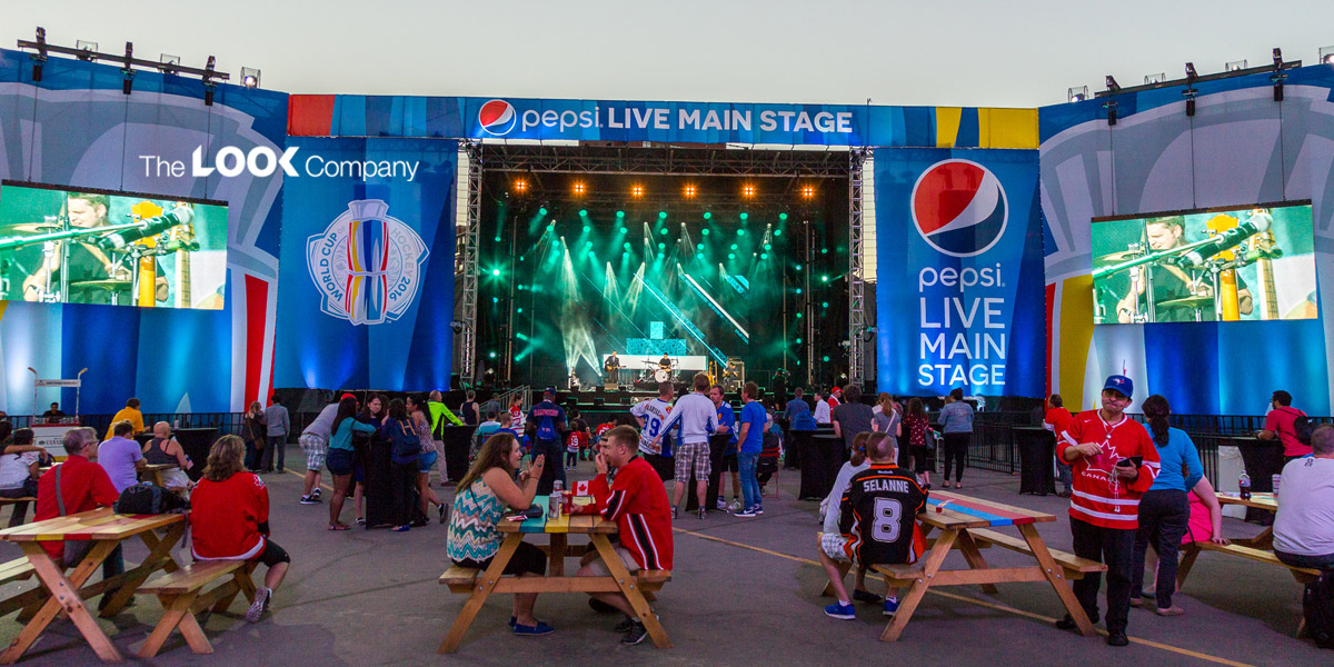
With my ideas figured out, I started designing the views of the activation. I started with the DJ stage at the festival because I had a clear vision of what I wanted it to look like. I found a couple of examples of stages done for Pepsi and Prime Video’s show The Boys that I liked and took elements from them. To save time, I took advantage of stock elements in creating the actual stage. This allowed me to focus more on the branded elements and making the overall experience cohesive.
One part of The Boy’s stage that I liked was the logos and pictures on the bottom banner. I thought this could easily be applied to Drive to Survive by using the show's and Netflix's logos. I also hopped into Photoshop to create a collage of some of the most well-known drivers in the show. The drivers themselves are staples of the brand, and I would argue that some are more recognizable than the logo. So, I thought this would further tie in Drive to Survive’s brand visibility at the festival.


From there, I spent most of the time fine-tuning where all the elements went and making the brand feel integrated. I think the checkered backgrounds that come off the side of the stage add an eye-catching feature, and I really like how they turned out. Overall, I am proud of how this view turned out and am excited to work on the next views and make this festival come together.