


Colored Illustration
Original Illustration
Linear Illustration
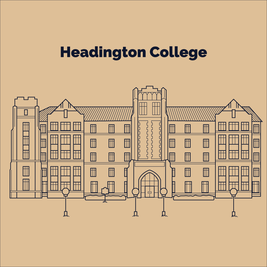
This linear illustration was one of my favorite projects that I did at OU. Our prompt was to illustrate a building around campus using only two stroke widths and one stroke color. I was determined to capture the complex details and dimensions of Headington while still maintaining a clean and modern look. I relied heavily on the different stroke widths to create contrast and a hierarchy throughout the design.
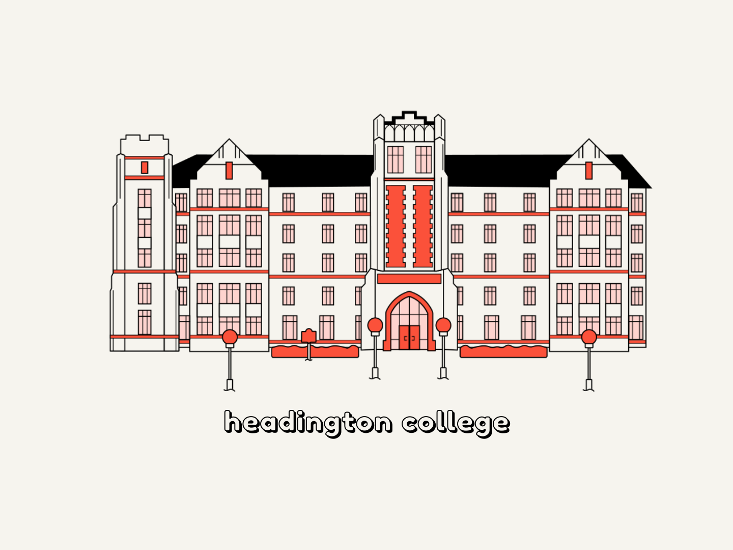
In my free time, I decided to see how I could animate the illustration. I decided to recolor it as well, taking inspiration from the bright red of the Headington College crest. I got a lot of practice with overshoots in this animation, and I like the bouncy look it gives the animation. I tried not to overdo it though because there are a lot of littler elements in the design, and I thought it could start to be distracting. Overall, I'm really proud of the animation and what I was able to do with it.