
For our third project in Digital Design II, we designed the cans for a fictional Dunkin’ Donuts energy drink and got to play around in Adobe 3D Stager to create a mockup of the design. In the first two projects, we worked with nonexistent brands, and I thought this project was interesting because we were creating something for an established brand. My professor had us take a look at the brand guidelines, which were a great source of inspiration for me. I wanted to ensure that my design would look like something Dunkin would actually sell.
After browsing the brand guidelines, I started researching other energy drinks to see what was popular and created an inspiration board of sorts.
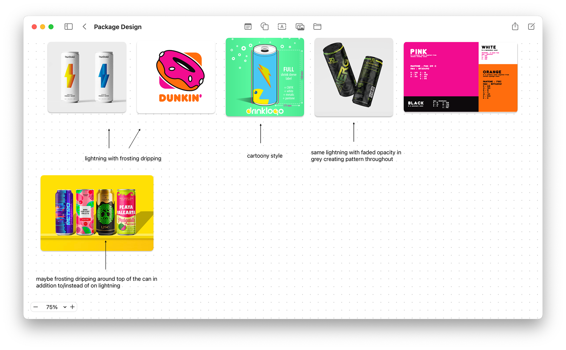
There were a lot of elements from different cans that I could see in my design. I thought the lightning bolt would be a classic logo for an energy drink and liked the incorporation of the background art in the bottom picture. However, I noticed that a lot of energy drinks have bold and almost aggressive designs, and even though Dunkin’ used bright colors, their aesthetic felt softer. From their font to their logo, everything looked smooth and any sharp points were rounded off.
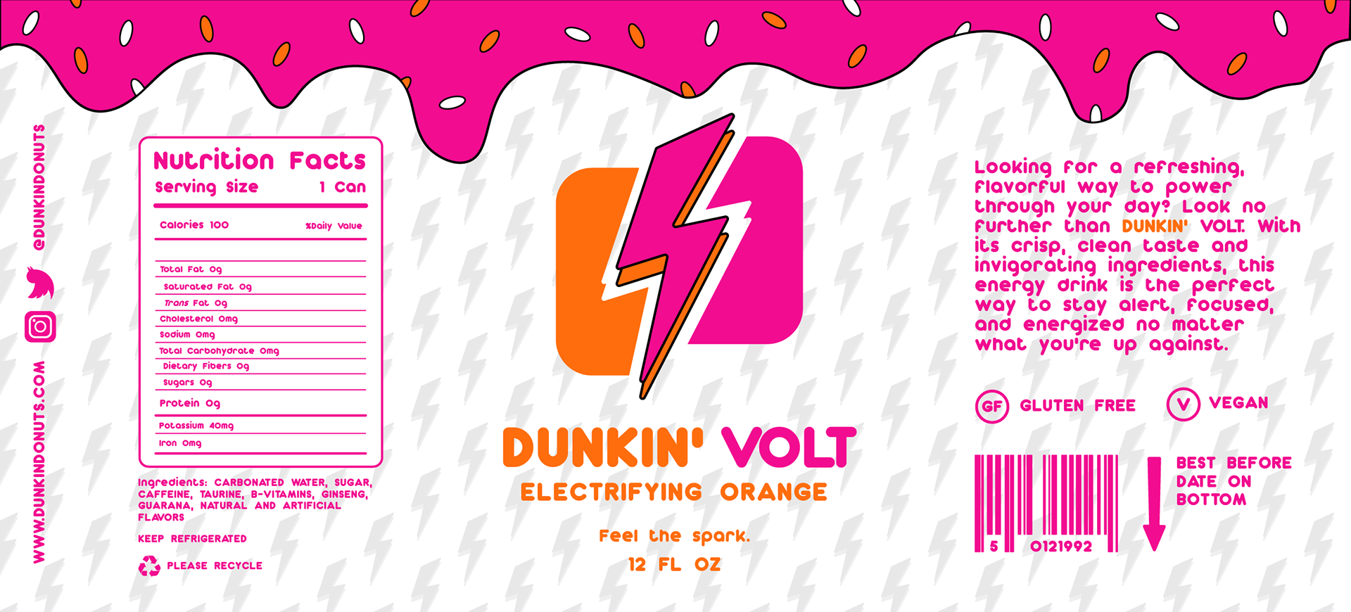
With this in mind, I started on my lightning logo. I stacked the lightning bolt to get both colors in the main image, like the donut in Dunkin's logo. I also brought in the two shapes around the logo to feel like it was cut out.
With the logo done, I moved on to putting other elements on the can. I knew I wanted to have some obvious things like nutrition facts, an ingredient list and a barcode, but I wasn’t sure what else past that. I went over to Dribbble to look for mockups and found this coffee drink design. It gave me some great ideas on other things to put on the label. Also, I decided to make all the text elements in the Dunkin’ font. Even though it added time, I think it brought the design together and would make it stand out against all the other energy drinks out there.
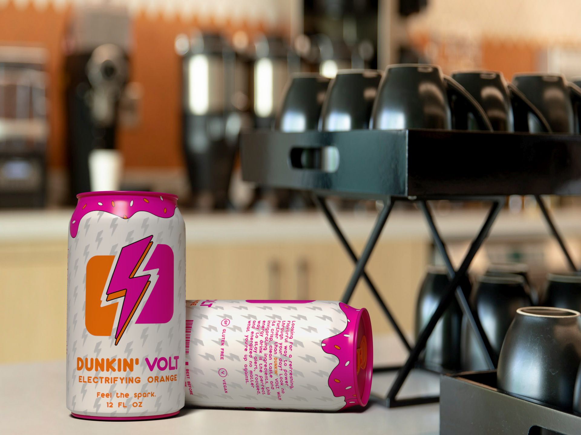
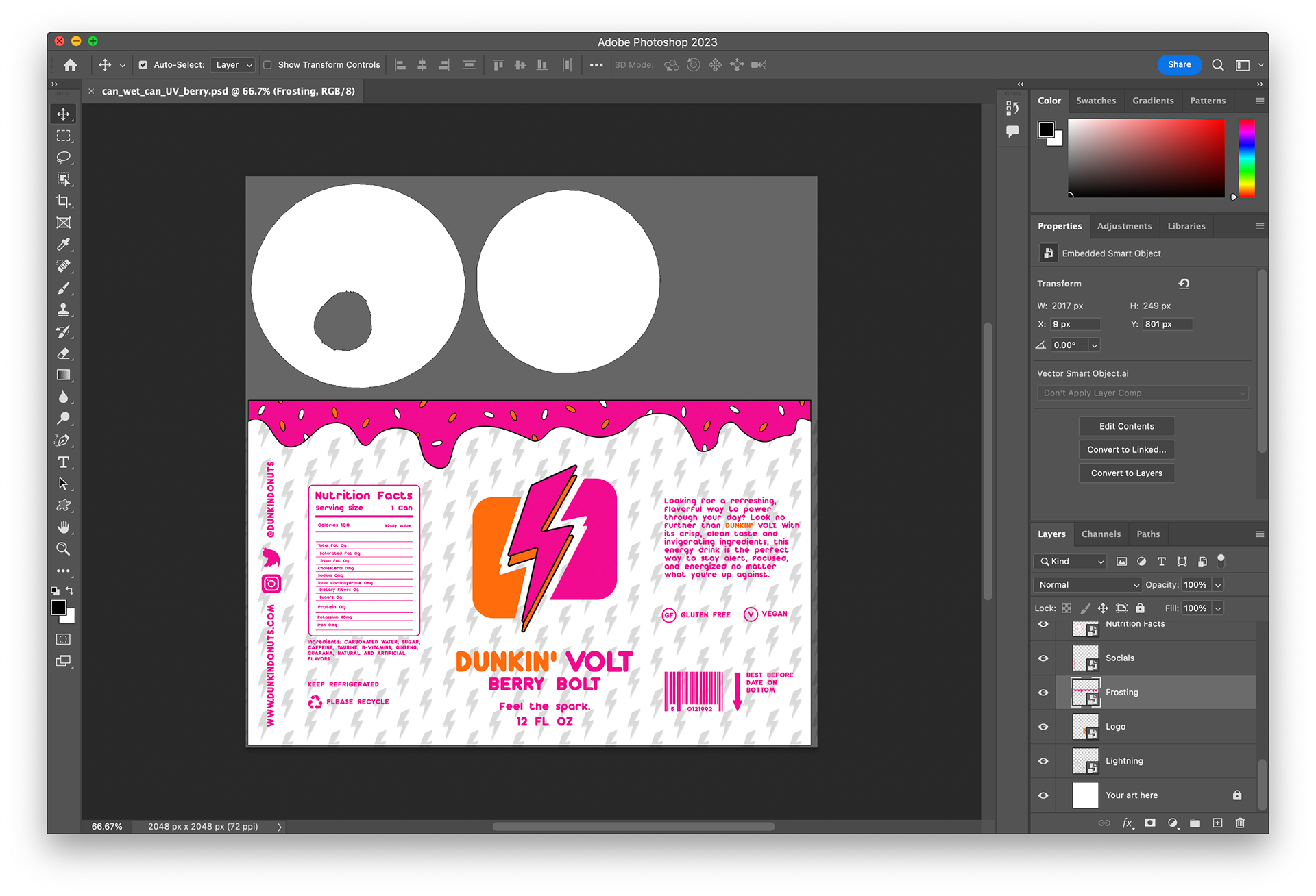
Once I had everything I wanted on the label, I turned to 3D Stager to make the mockup. This was my first time doing 3D modeling, and it was a great learning experience. It really helped to visualize how the label would wrap around the can and how to place the different elements. I looked up some mockup tutorials on YouTube to get an idea of other designers' workflows, and through this tutorial, I learned a little about exporting the model's UVs to put your design on a mockup more precisely. Put simply, UVs are a 2D representation of the 3D model. The UVs are exported to Photoshop files that show where exactly to put your art, and it was very helpful in making sure my design fit the model perfectly.
From there, I started playing around with incorporating my model into an environment. Throughout this process, I liked user-friendly Stager was. It was very easy to find different assets to use and properties to experiment with. I eventually settled on an office cafe background mostly because it was the one of the only ones to have a counter close up. I also thought the coffee in the background supported the idea that this drink was for people looking for a mid-afternoon pick me up.
I spent some time making the final tweaks to the lighting but was never completely happy with how it looked in the scene, so I decided to render a Photoshop file to make more adjustments there. I think this was a good decision because I could edit in a software I was more familiar with. In the end, I am pretty happy with the final product, especially considering how it was my first time working with 3D models.