

Project Overview
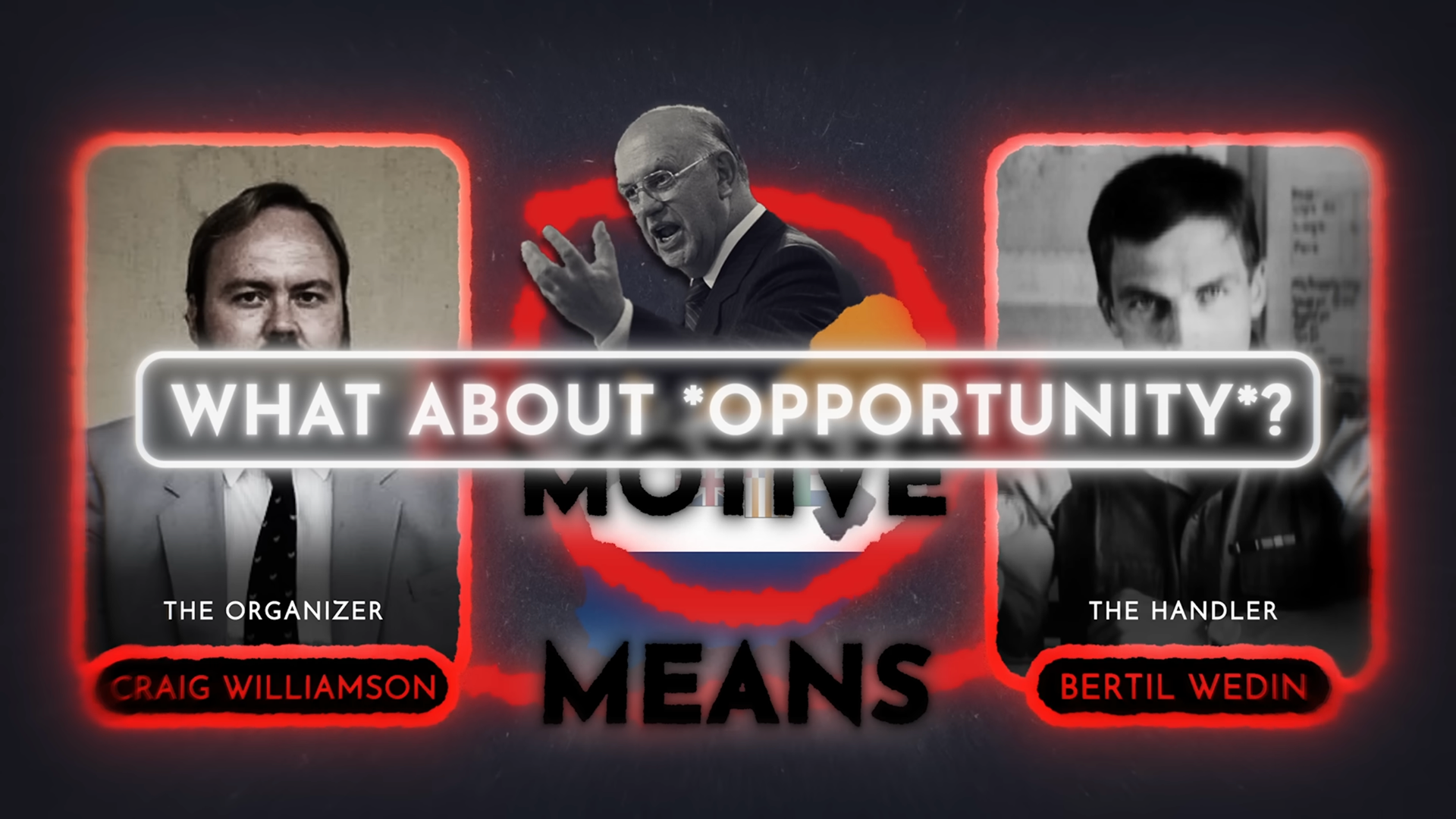
This was a short personal project where I wanted to experiment with a bold, documentary-inspired motion style. I wrote the script, sourced the music, and handled all the sound design, but the focus was on creating a 30-second visual piece that felt sharp, fast, and editorial. I designed all the graphics from scratch and leaned into high-contrast colors and glowing edges to get that financial/true crime feel.
Research
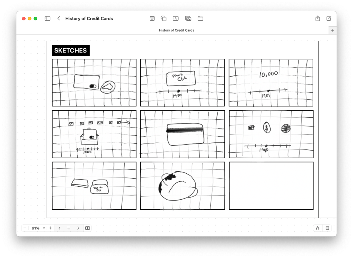
I looked at a variety of motion-heavy explainers and financial docs for inspiration, particularly those with strong editorial framing and snappy transitions. I also pulled visual references from sources with a slightly gritty tone to bring a tactile feel.
Design
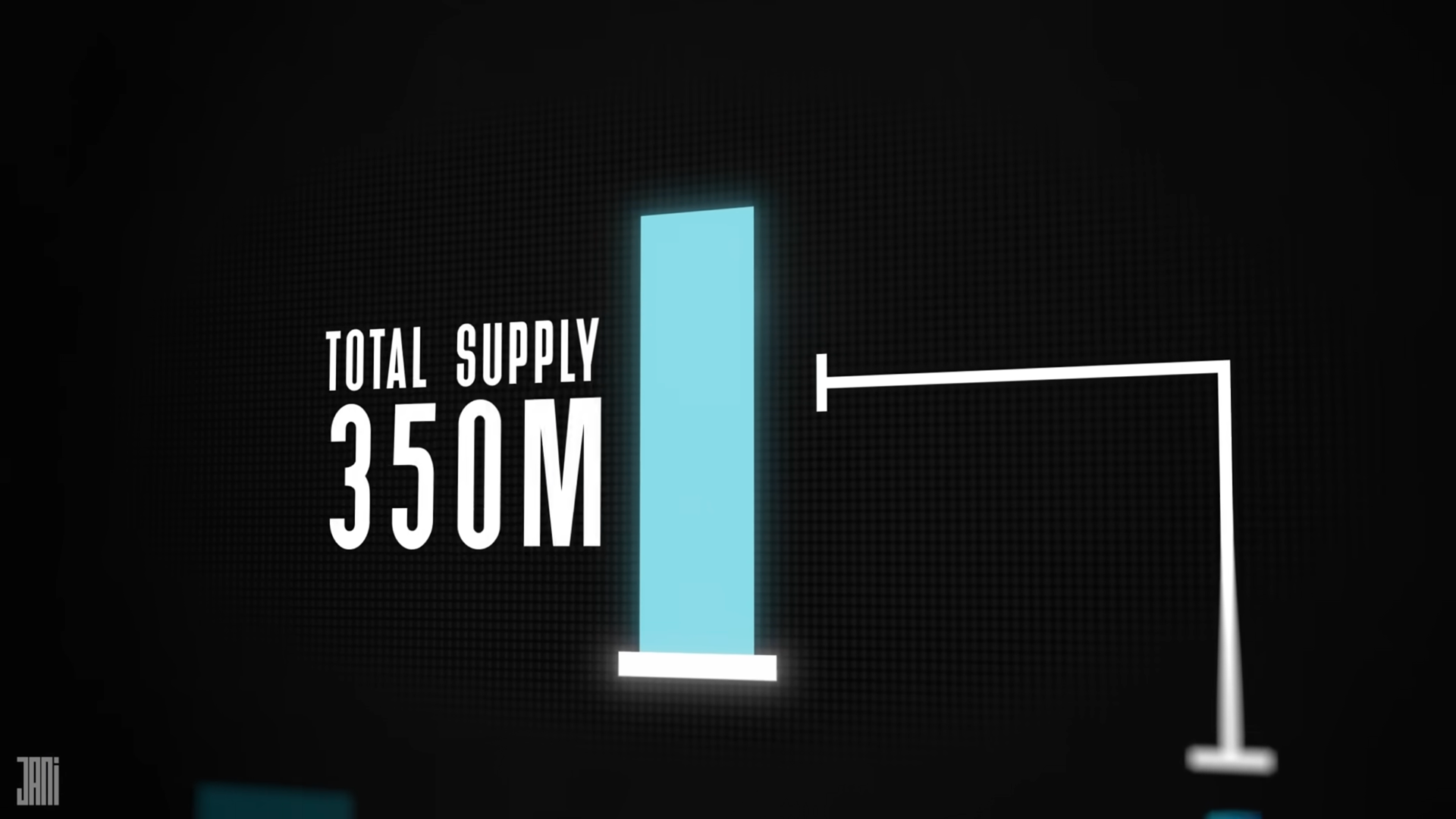
For the design, I wanted to keep things minimal but still punchy, with strong type and bold contrast. I used thin strokes and sharp corners throughout to keep things crisp and clean-looking.
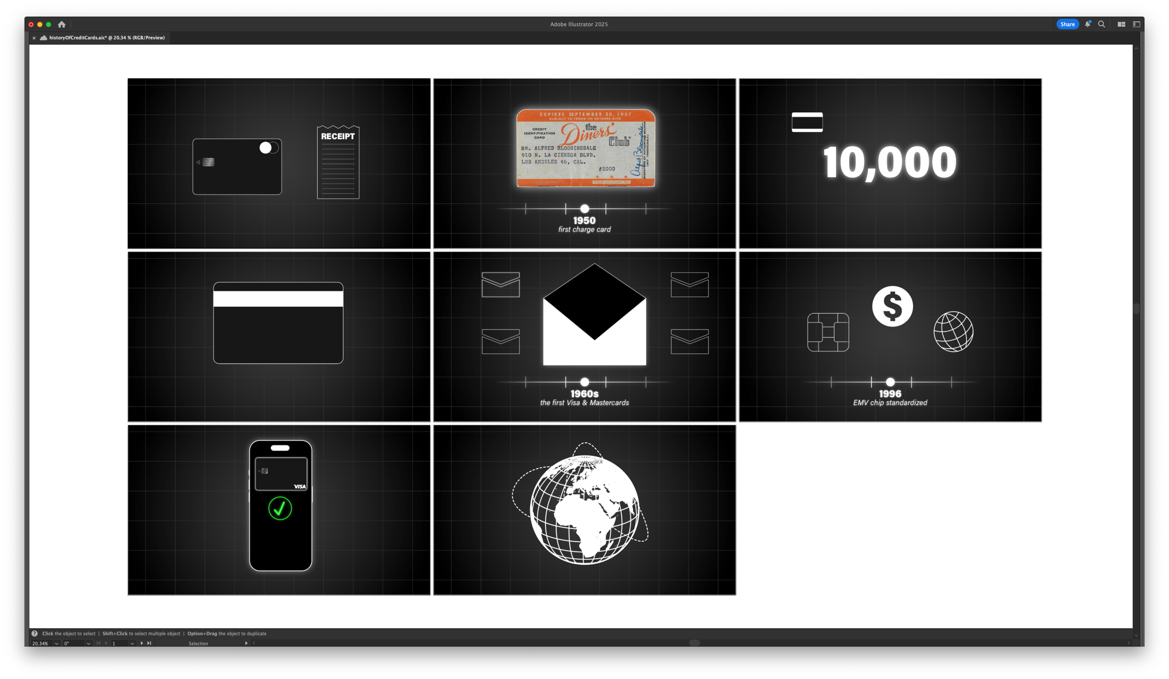
I planned each shot around a clear heirarchy with the year label at the bottom and supporting graphics on top. I also used glow and blur effects to add depth and give the animation that stylized “infographic documentary” feel.
Execution
This project was a great exercise in layering. I used mattes, masks, and adjustment layers to create depth, especially in the blurred and glowing effects. Combining those with quick camera moves and snappy text animations helped keep the energy up throughout the piece.
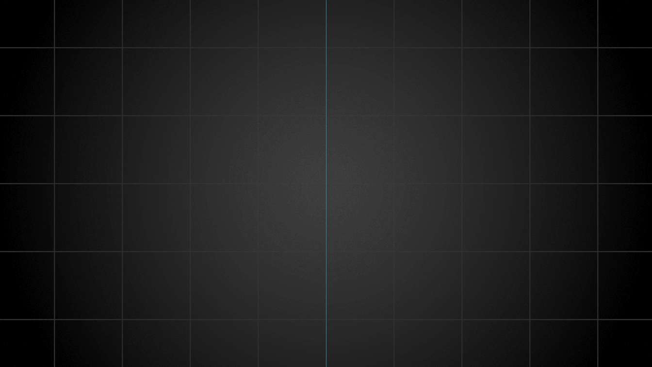
Adjustment layers used to add blurs
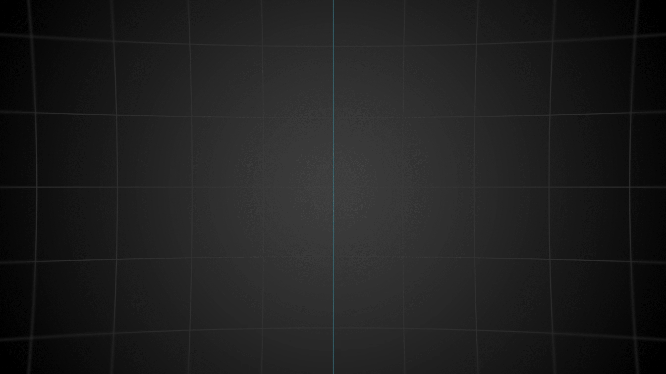
Adjustment layers with graphics
That's all folks!
This was a fun project to break out of my usual style and try something moodier and more editorial. It was a great way to experiment with new techniques while keeping things short and focused—and I’d love to build out more pieces in this style down the line.