

Over the past couple of weeks, we have been working on our second project in Digital Design II. This project primarily utilized InDesign to create a creative brochure for a fictional fashion company called Cloth. I’ve only ever worked in InDesign one other time when designing a social media campaign, and I was excited to use it for a print design. I quickly became a fan of its user-friendliness and how easy it was to take assets from Photoshop or Illustrator and pull it into a project.
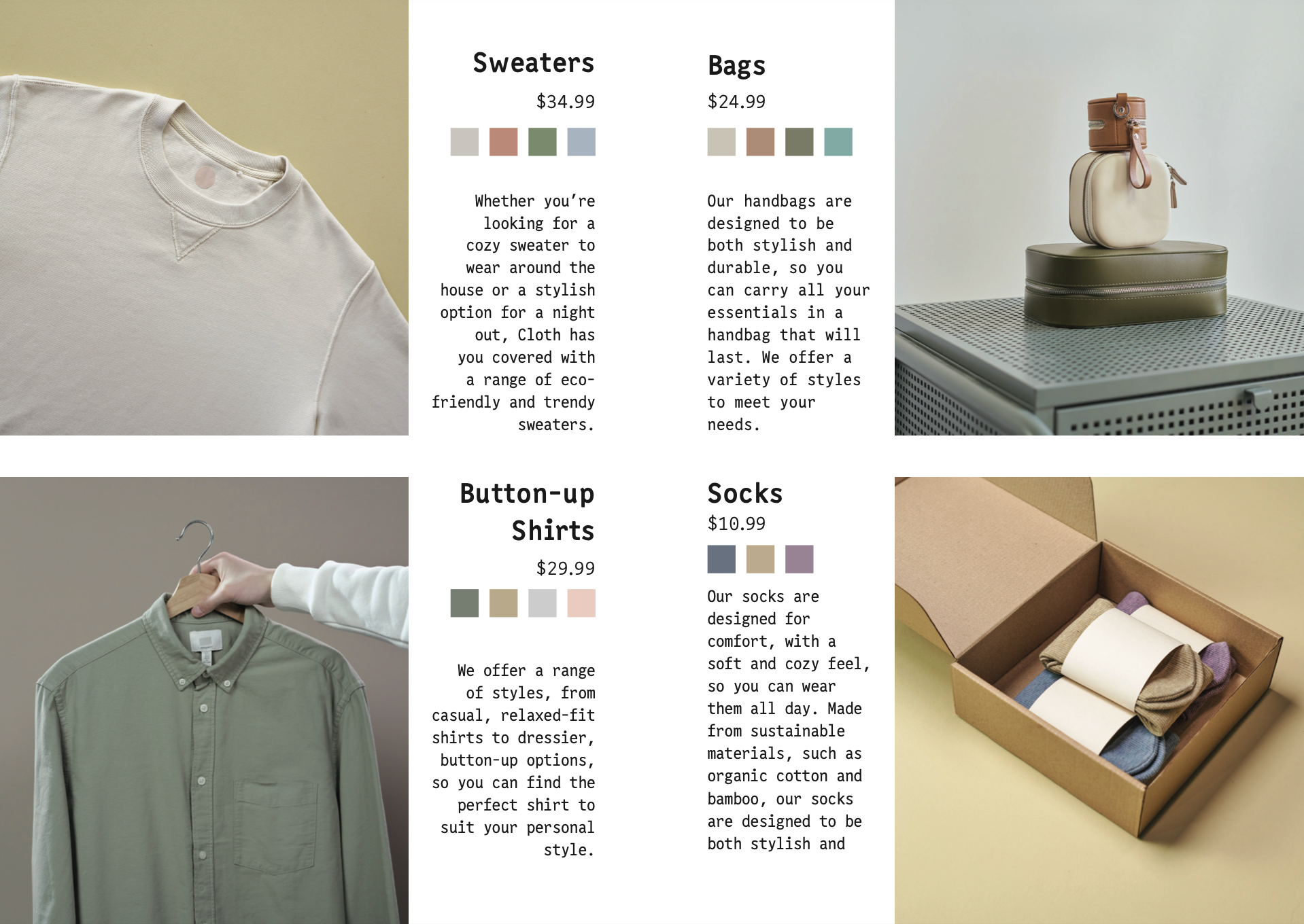
We were provided stock images to use, which helped me get a little inspiration. I thought the clothes felt very trendy and modern but still comfortable. Many of the products were in darker greens, maroons, or blues, and I thought this lent itself to a fall aesthetic, so I decided the brochure would be for a fall collection.
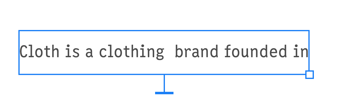
For a lot of my design projects, I start by picking out a font. For me, the right font is central to the overall aesthetic of a piece and inspires other elements. The font in this project was critical because of how copy reliant it was. I imagined Cloth to be a very trendy, yet rustic, brand and thought the combination of Casablanca URW and Narkiss Yair Variable created that vibe.
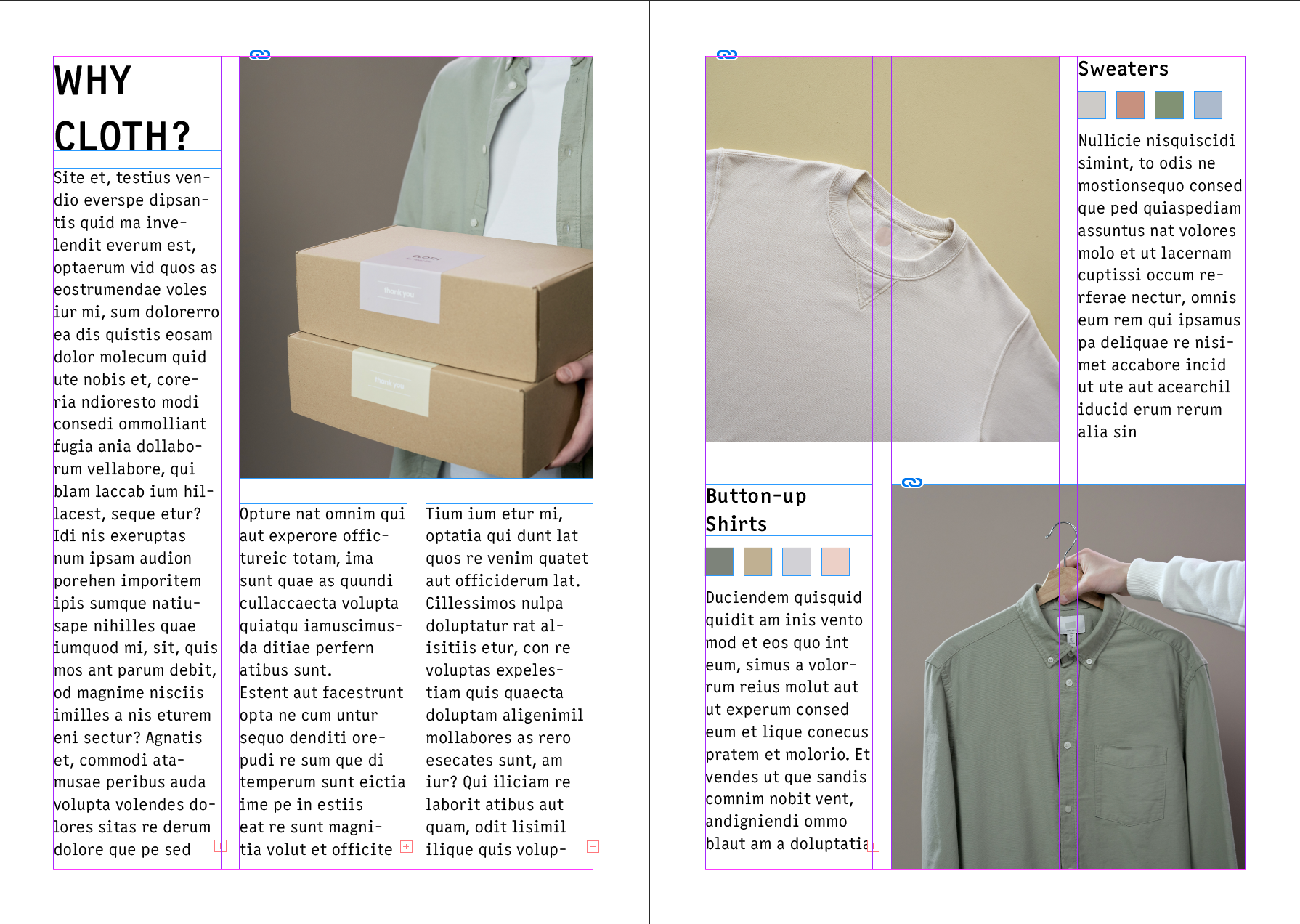
However, when I got to designing the layout, it was a challenge for me. I had never done page design before, and I found myself getting stuck on how to structure the page and what content to put on them. I scoured the Internet for other examples and took a lot of inspiration from this template. I liked how it separated products into collections and had small boxes showing what colors the product was available in. Also, I took elements from this template, specifically how they structured their headers and paragraph text.
With an idea of what I wanted it to look like, I created a dummy layout and started placing pictures I liked. I stayed away from pictures with models wearing the clothes because I thought it could give the viewer a preconceived idea of who the clothes were for. I wanted the viewer to be able to imagine themselves in the clothes. Eventually, I came up with a first draft.
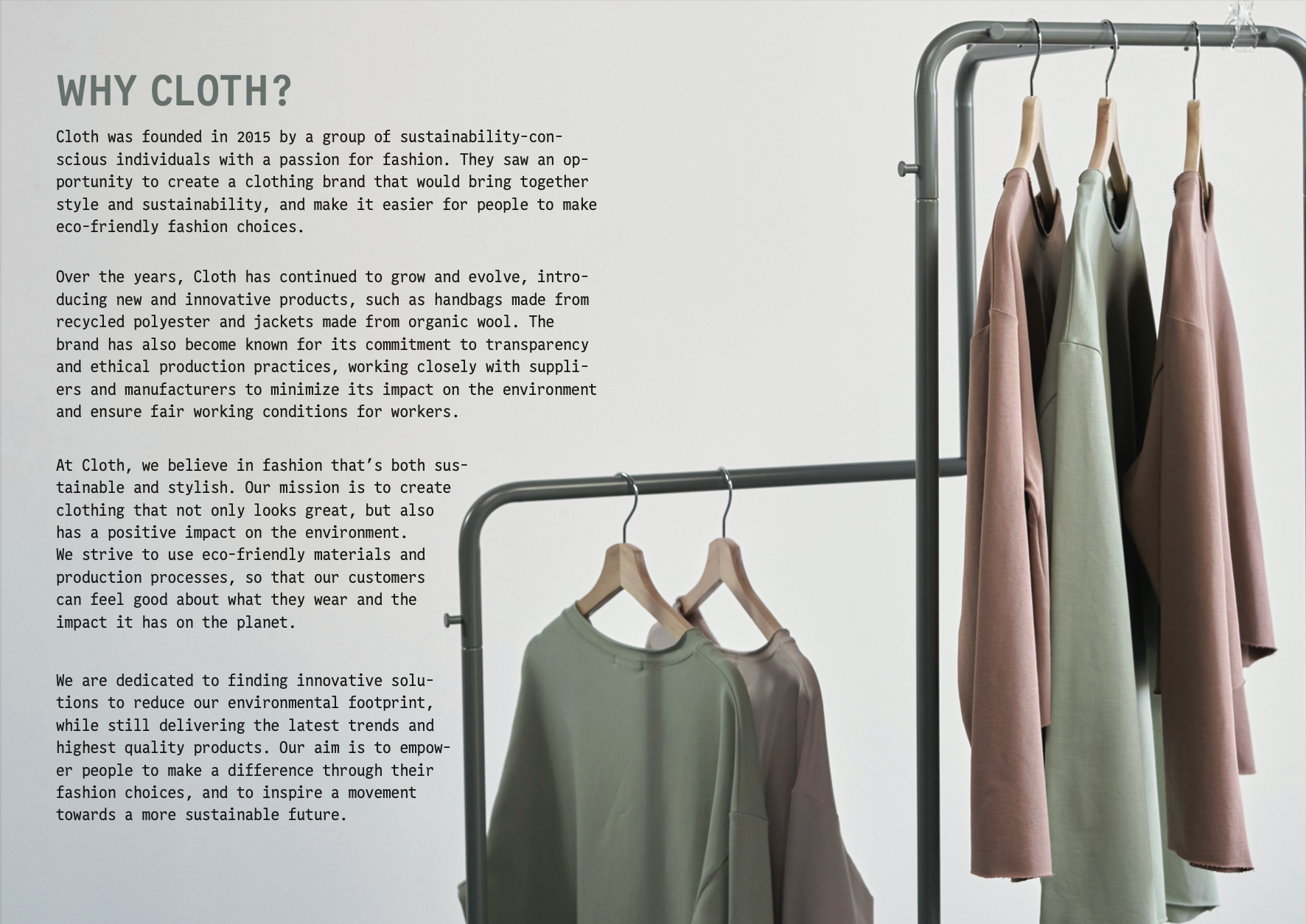
It was a good starting point but needed some improvements. With how my text was laid out, I thought my first page looked too much like a newspaper article. Also, I felt like, in general, it was too plain and needed more aesthetic elements. Stuff that wasn’t just text or pictures of the products. I decided to add a page after "Why Cloth?" to give that section a full spread and push my product pages on the same spread. I found this picture of clothes hanging on a rack and thought it would look sleek if the text wrapped around the shape of the rack, so I decided to make it the background of the entire spread. This change made the section look more visually appealing to me.
With this spread revamped, I thought my product pages had too much white space in comparison. At first, I wanted to add shapes or something like that around the edges, but nothing felt right. I started experimenting with the images and decided to extend them to meet the edges of the page. It looked weird with the pictures on opposite edges, so I moved my product pictures to the four corners and put all my copy down the middle. It wasn’t something I thought I would like in the end, but I was surprised to see it looked pretty sleek, and it helped eliminate some of the white space.
Overall, designing this brochure was a challenging experience. I had to apply my design skills in ways I haven’t before, but I ended up with a final product that I was proud of. I also enjoyed working more in InDesign and have become more comfortable using it. This project taught me valuable lessons that I will take with me into future projects.