
Project Overview
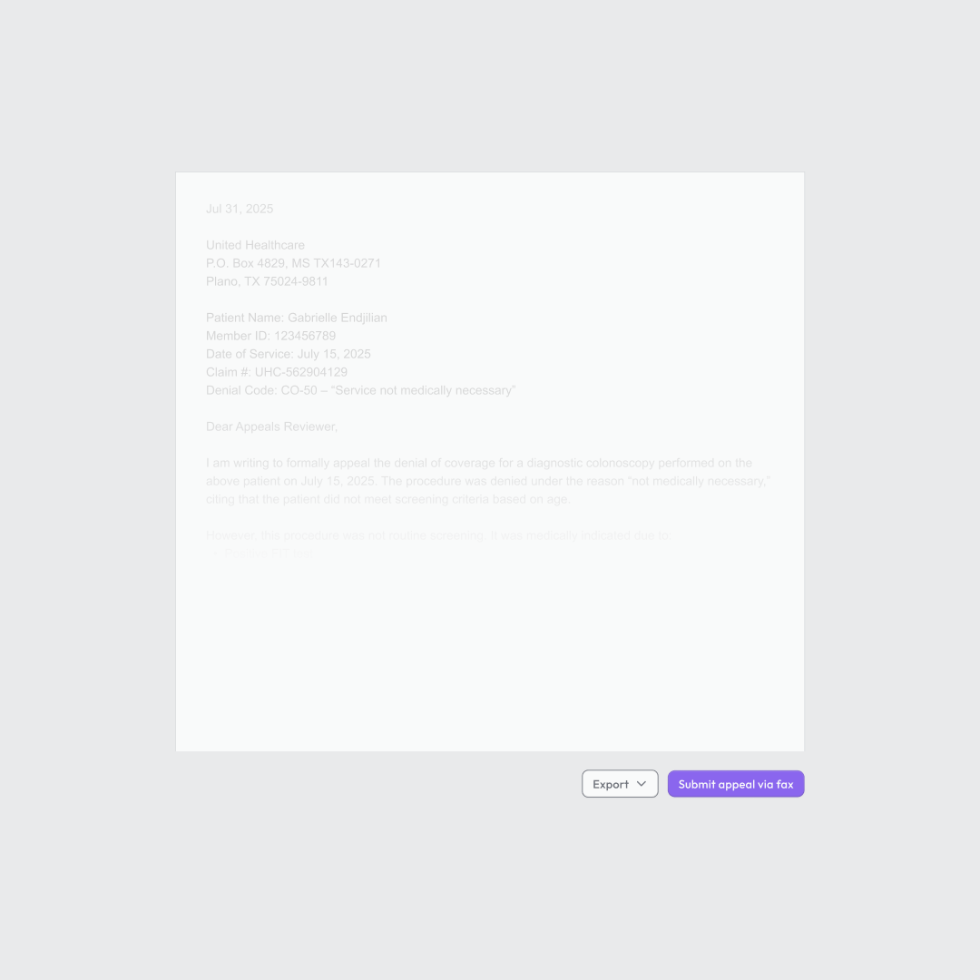
Dara is a healthcare startup that helps providers and create and submit insurance appeal letters, saving time and increasing reimbursements. For this project, the client wanted a hero animation that would clearly walk viewers through the product flow. Following the first animation, the client brought me back to update the animation as their product changed.
Updated Version
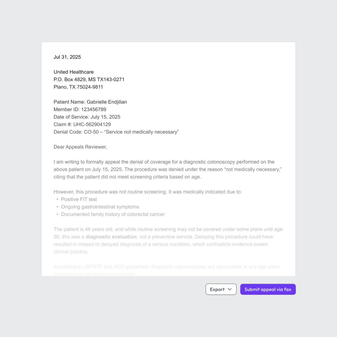
As the client refined their product and brand goals, they brought me back to update the hero animation to better align with their new direction. For this version, the client provided storyboards, and my focus was on animation and pacing. Besides reflecting a different user flow, the revised animation also adds in captions to help provide clearer context.
Design (first version)
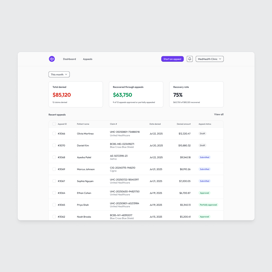
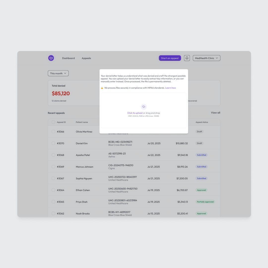
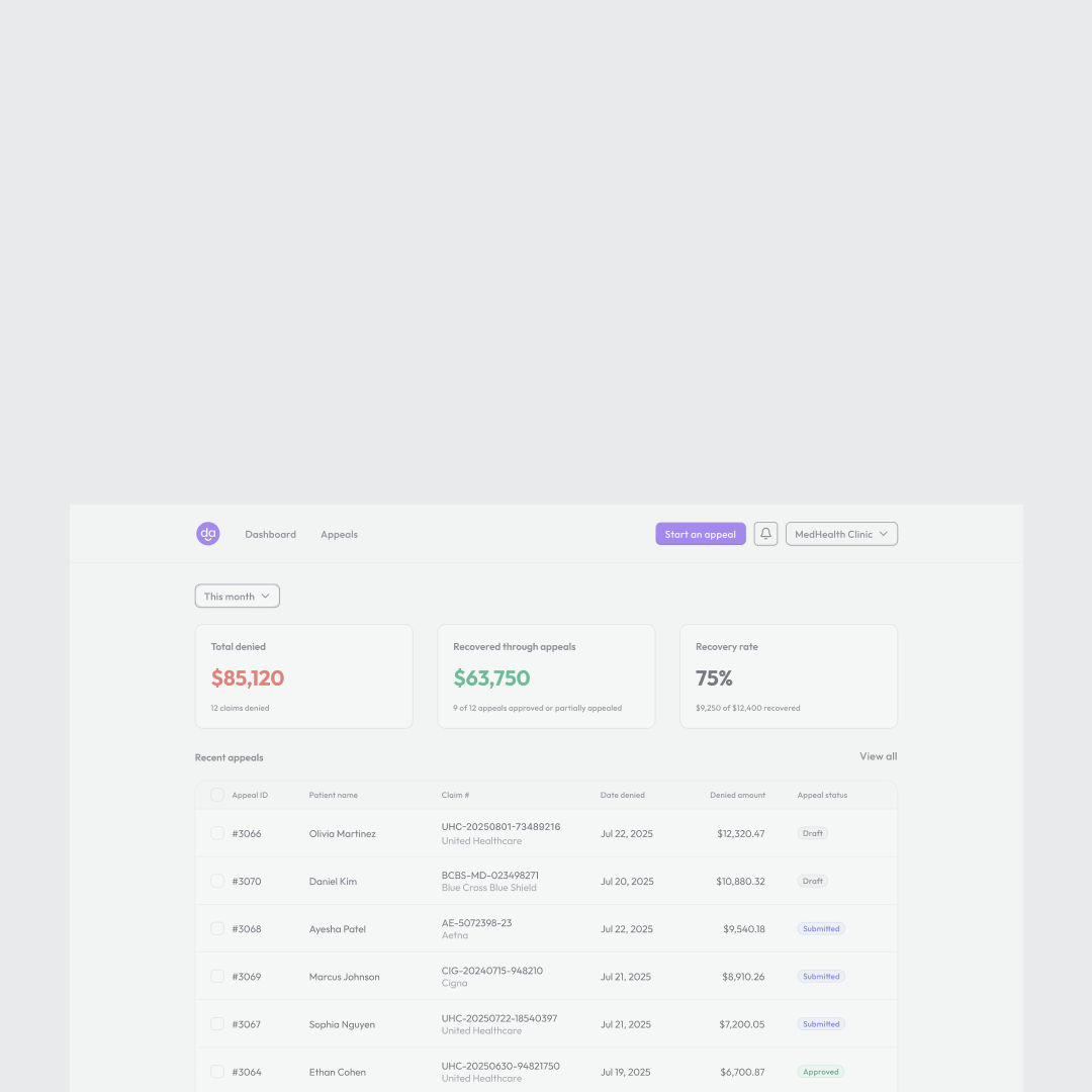
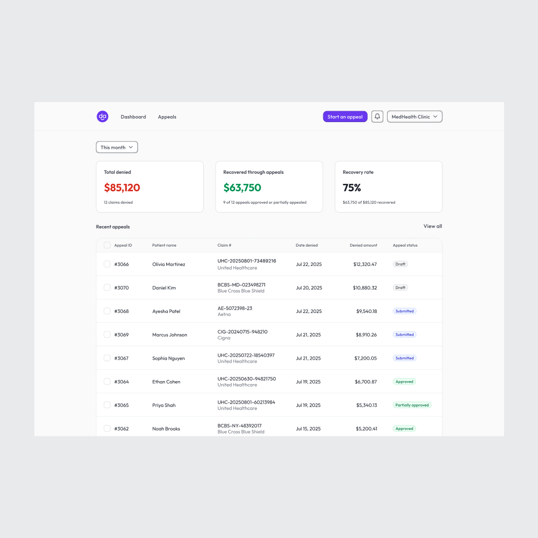
Dara already created a strong layout and visual direction for the app, so most of my design work focused on tweaking a few elements to make them more animation-ready and draw the viewer's attention to key elements.


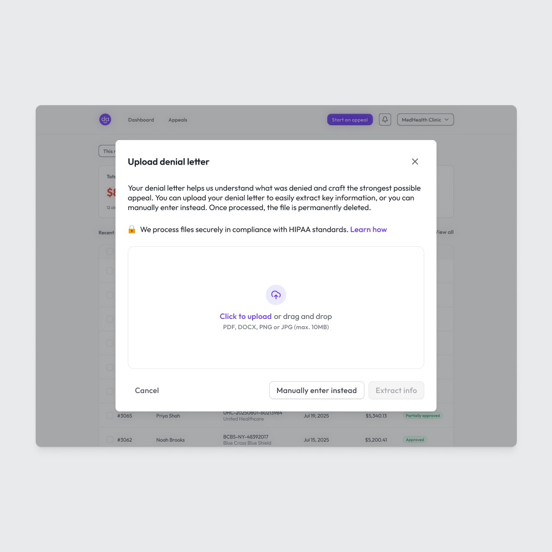
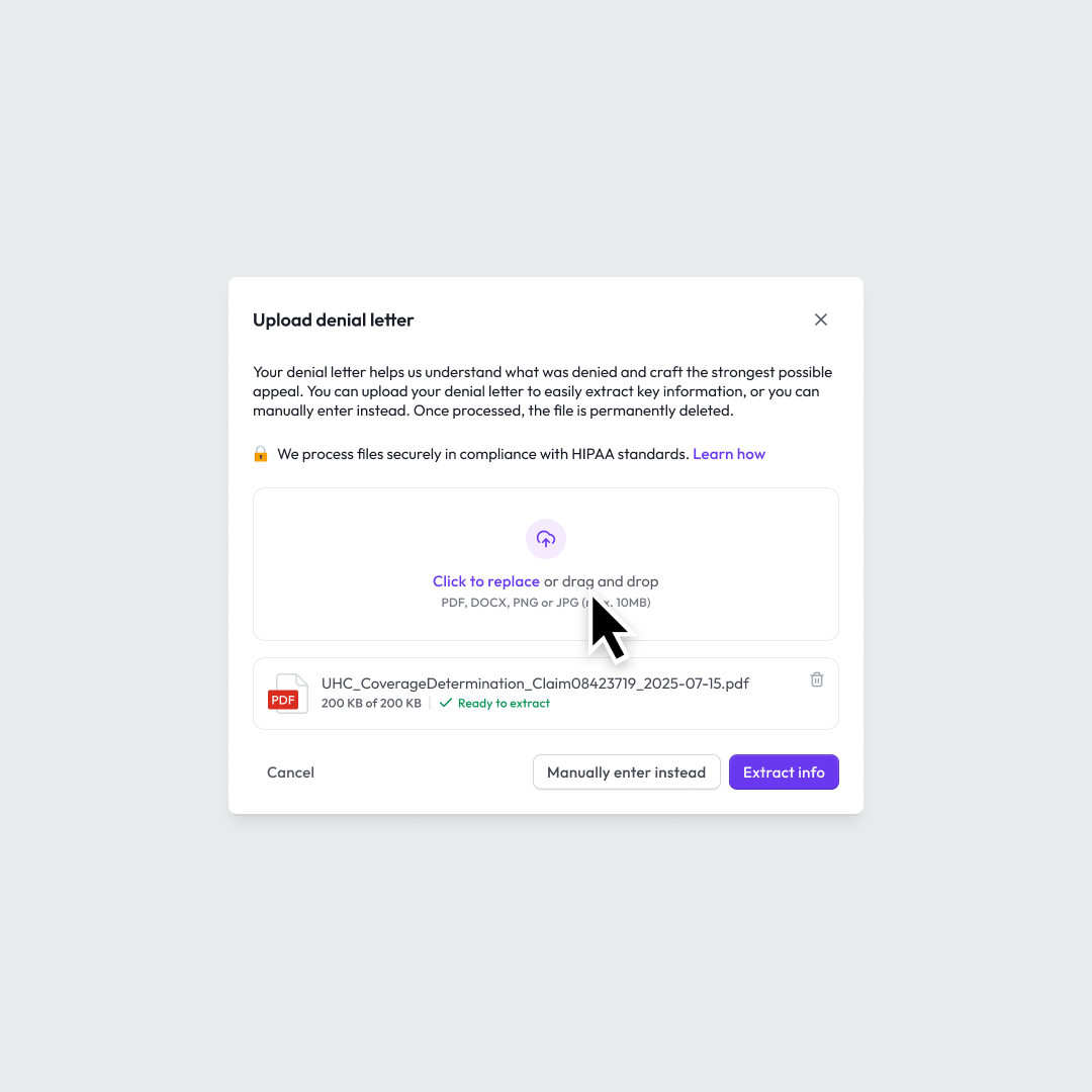
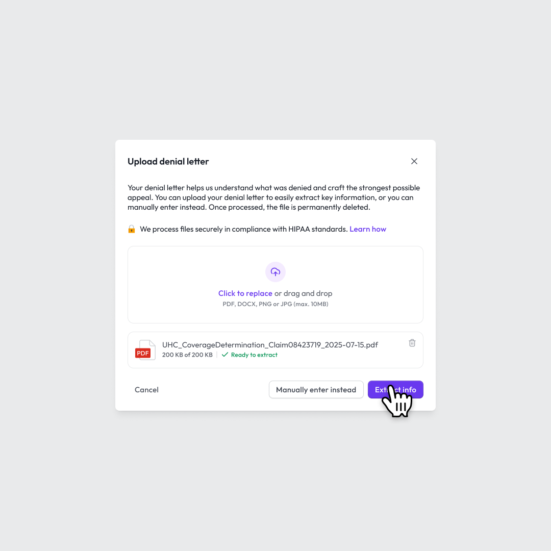
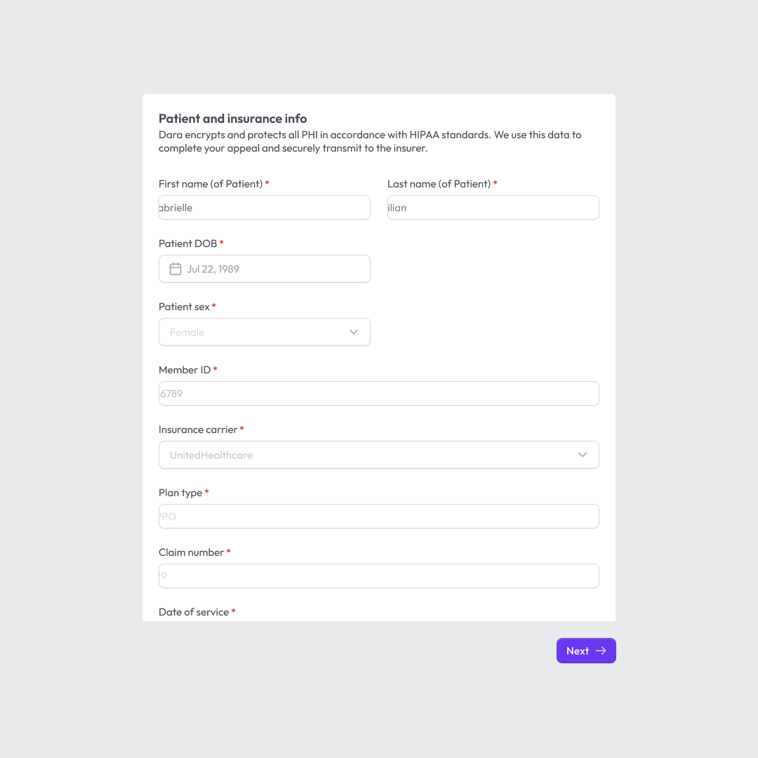

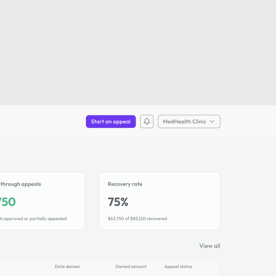
I also created storyboards (first draft is shown above) to map out the flow and pacing of the animation, making sure the transitions felt smooth and intentional.
Execution (first version)
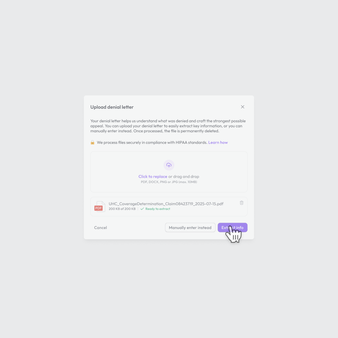
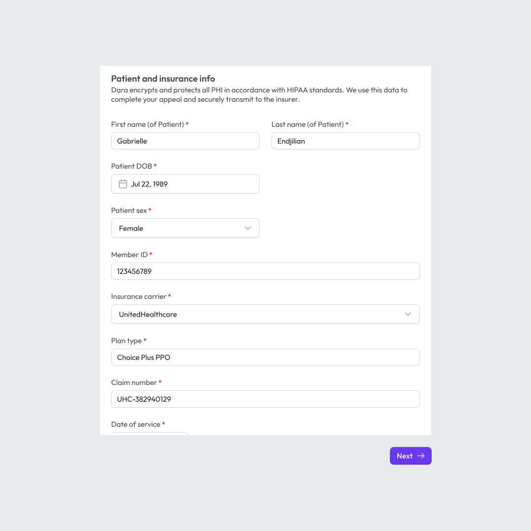
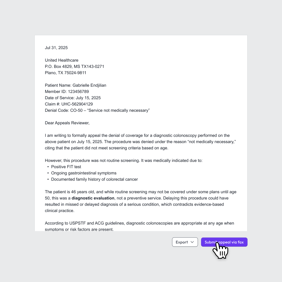
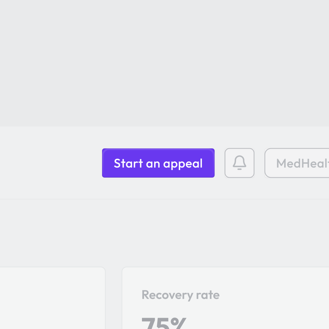
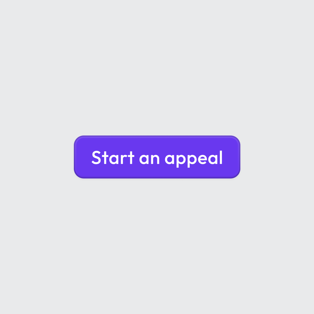
The animation is clear and to the point, balancing motion that keeps things visually engaging without distracting from the product itself.
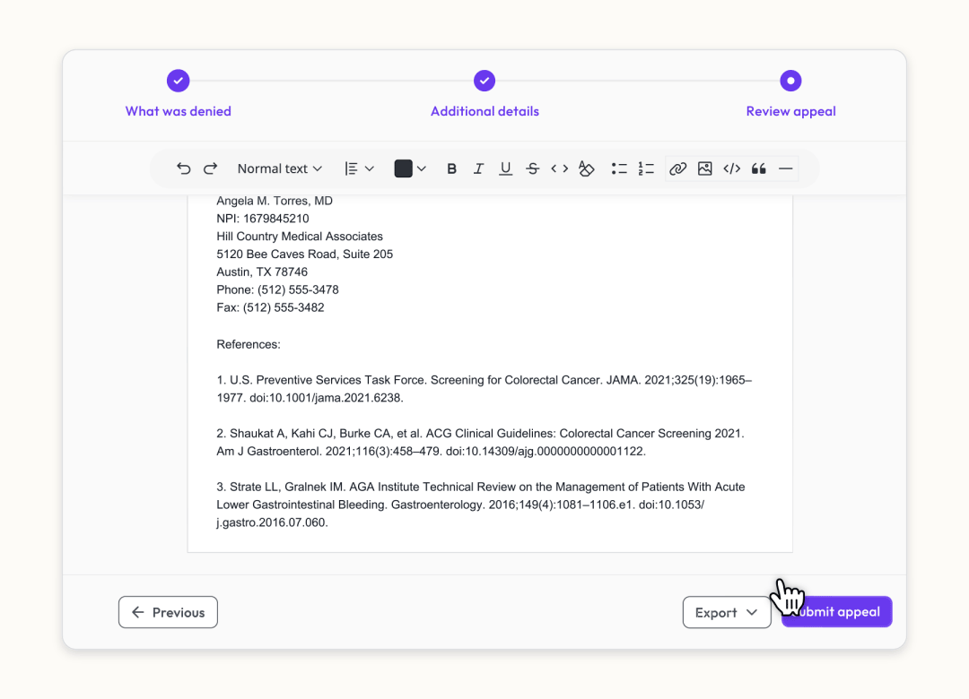
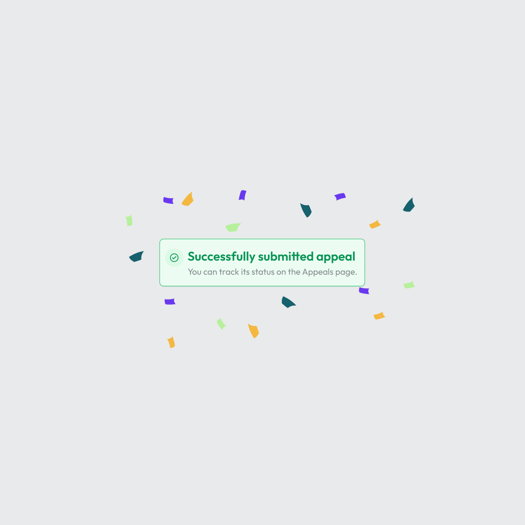
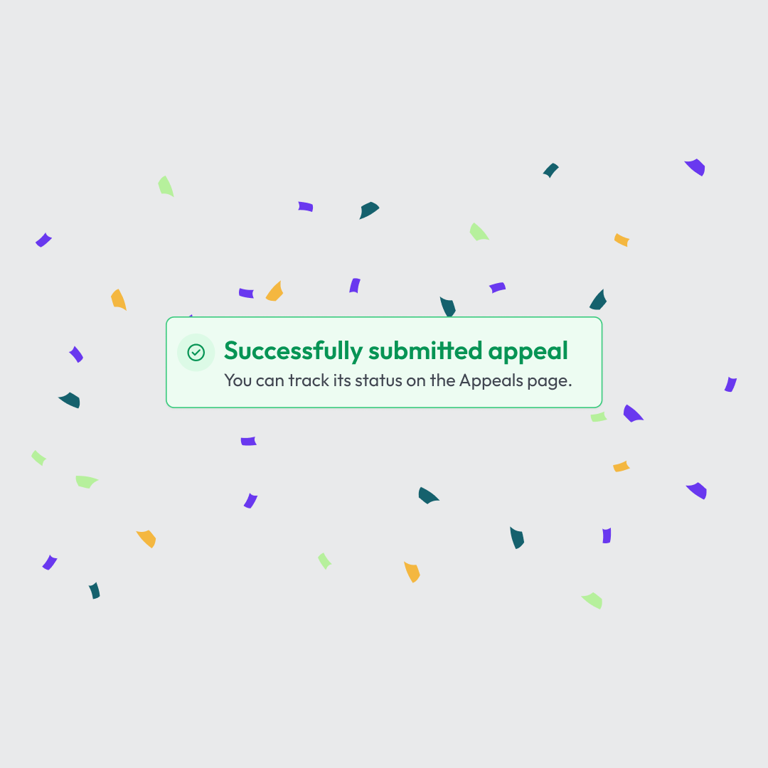
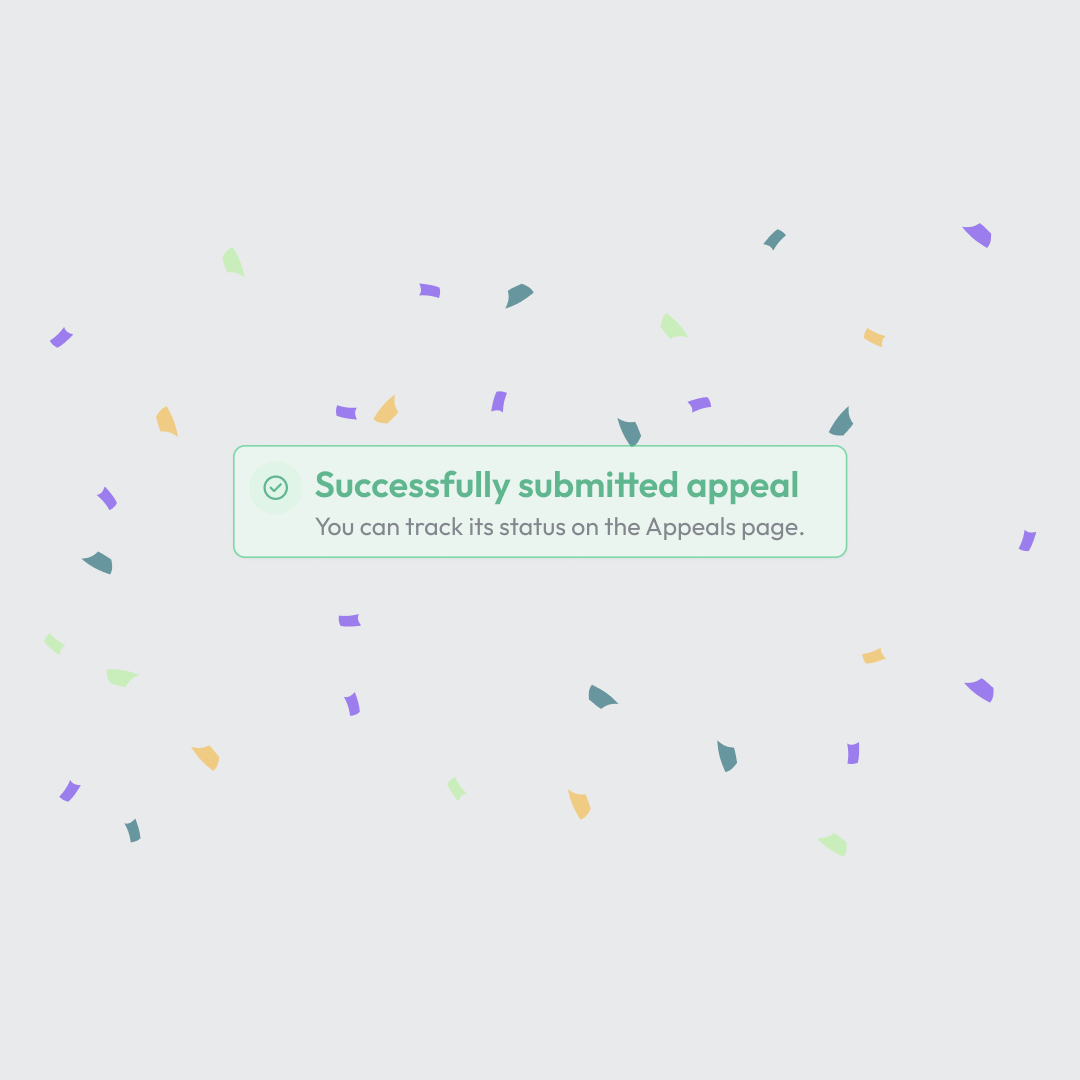
One of my favorite details is the confetti animation behind the success toast when the appeal letter is submitted. It adds a bit of fun to the piece without feeling out of place.
First version
That's all folks!
This project was a great example of working with an already strong design system and focusing on animation that enhances function. It was fun to keep things minimal but still add a bit of personality along the way.