

Project Overview
For over 10 years, Bluebird Branding has been helping brands grow through data-driven strategies and top-notch creativity. Their team over reached out to me to collaborate on a logo animation that supported their brand refresh. The project took 2 weeks to complete.

Execution
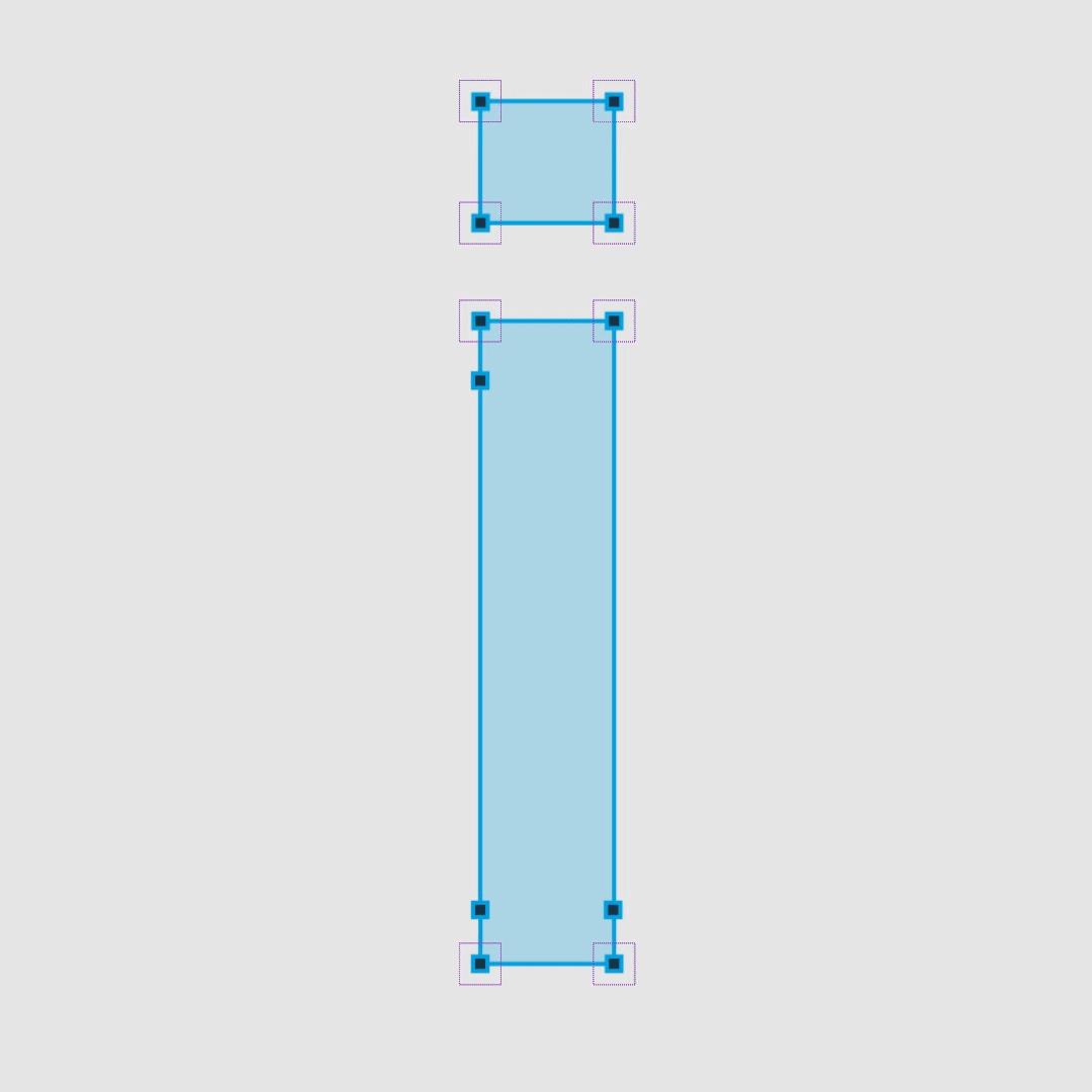
Bluebird's new logo was moreso a refinement rather than a full rebrand. The biggest change was the new typeface, so this became the foundation of the animation. The client really liked the idea of seeing the type morph from new to old and making it look like the changes were happening live. I paired this with some smooth camera movement to give the piece a cinematic feel.
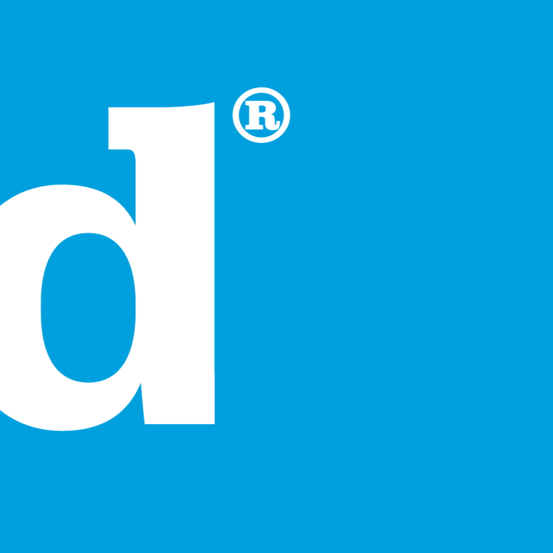
I continued the "active design" idea into the end where we see a mouse pulling the rounder corner and adjusting the placement of the registration symbol.
Having these final interactions at the end allowed these new elements to be showcased without drawing attention away from the new typeface.
That's All Folks!
While this wasn't the most high-energy animation I've ever done, it shows how subtle and simple techniques can be combined to make a smooth piece. I had a blast working with the Bluebird team and they loved the final product, using it to launch their brand refresh.