

For the first project in our Digital Design II class, the prompt was to use Adobe Photoshop to make a movie poster where the title text showed the word’s literal meaning. My professor used the movie poster for Disney’s Frozen as the prime example.
Initially, I struggled just to choose a word. This prompt reminded me of those typographic wordplay illustrations where designers would use the word to make a visual representation of its meaning. I researched some of those illustrations; however, I decided that going down that path was steering me in the wrong direction.
So, I changed my approach and started typing different words into Unsplash to see what pictures would pop up. I went for words like old, burned, and dry. Words that conjure obvious textures and images. I threw some pictures I liked into photoshop, but nothing inspired me to go further.
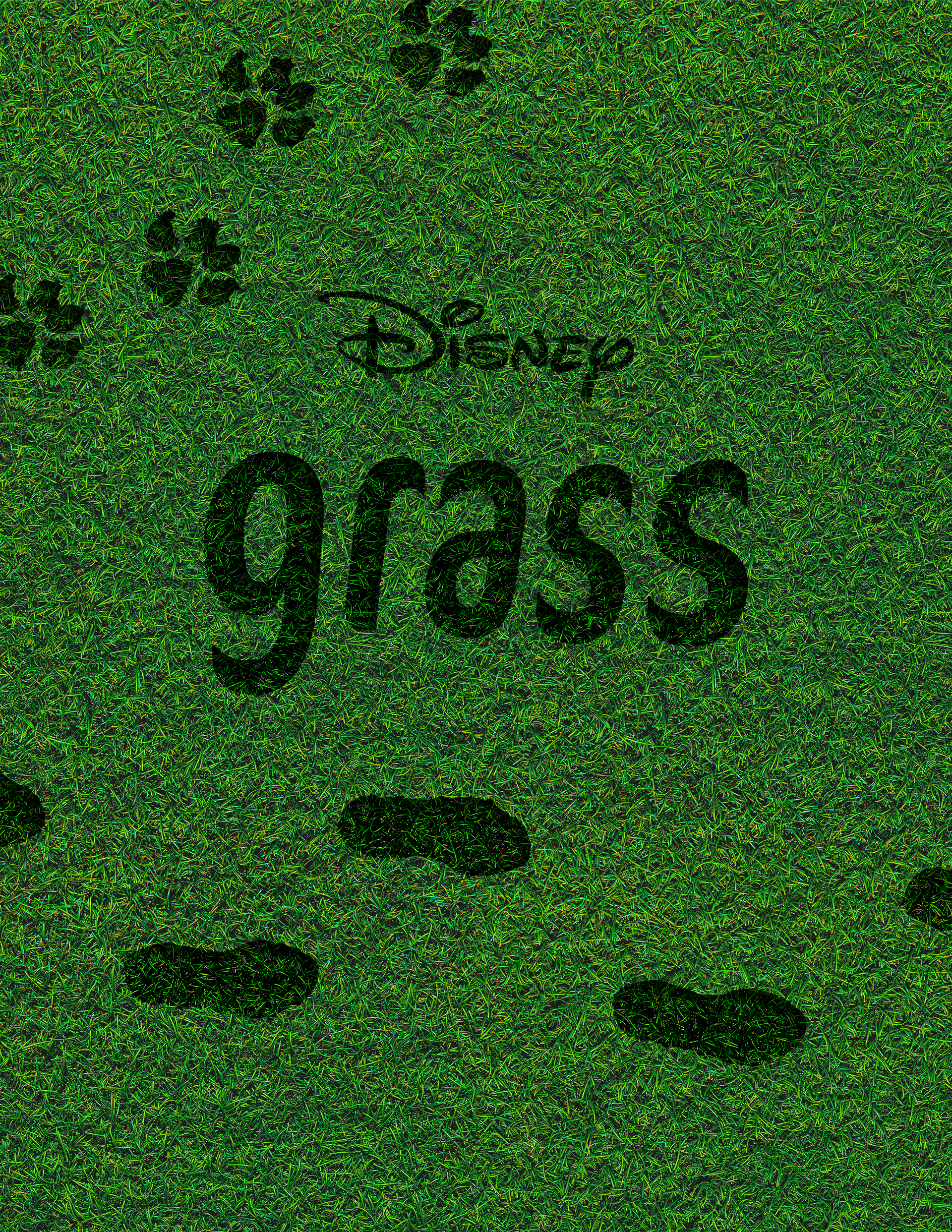
I went back to square one and reread the assignment instructions and one of the words in it stuck out: grass. It instantly reminded me of those posters for movies like Antz or A Bug's Life where they showed the world from their perspective on the ground.
I had an idea to do something similar. An eye-level perspective of the ground with the word grass cut out or overlayed amongst real grass. I took a different approach this time and figured out my font first. I knew I wanted a font with some character but also something rigid and eventually went with FF Cocon. I was drawn to this font because of how the letters tapered to a point at the ends. It reminded me of blades of grass.
Once I had the font, I began the search for texture and/or background images. I was originally searching for ones taken at the ground’s eye level, but in my search, I came across an image from a top-down view. This gave me the idea to use the title text as an imprint in the grass. Throughout this project, I struggled with how I would incorporate the background into the text and thought this was a great solution.
I messed with different blending modes and settled on an Overlay because it kept the definition of the background image the best. I also added Text Warp to the title to give the text a slightly wavy look to replicate grass blowing in the breeze.
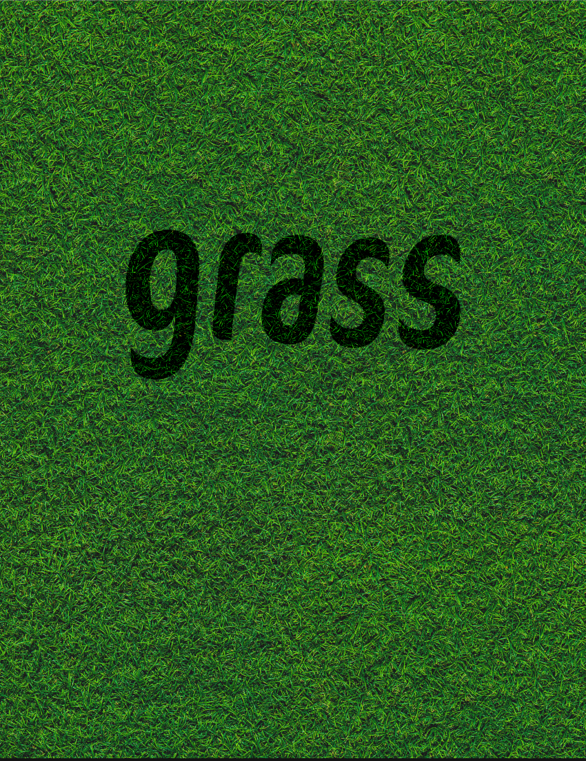
I liked how it looked so far, but I thought there needed to be something more to increase the contrast between the text and the background. I started trying out different layer styles and found that Inner Shadow was perfect. I think it really helped the text come across as an imprint in the grass.
From there, I wanted to add other imprints into the grass to give a little more context to the poster. I found foot and paw print images that I liked.
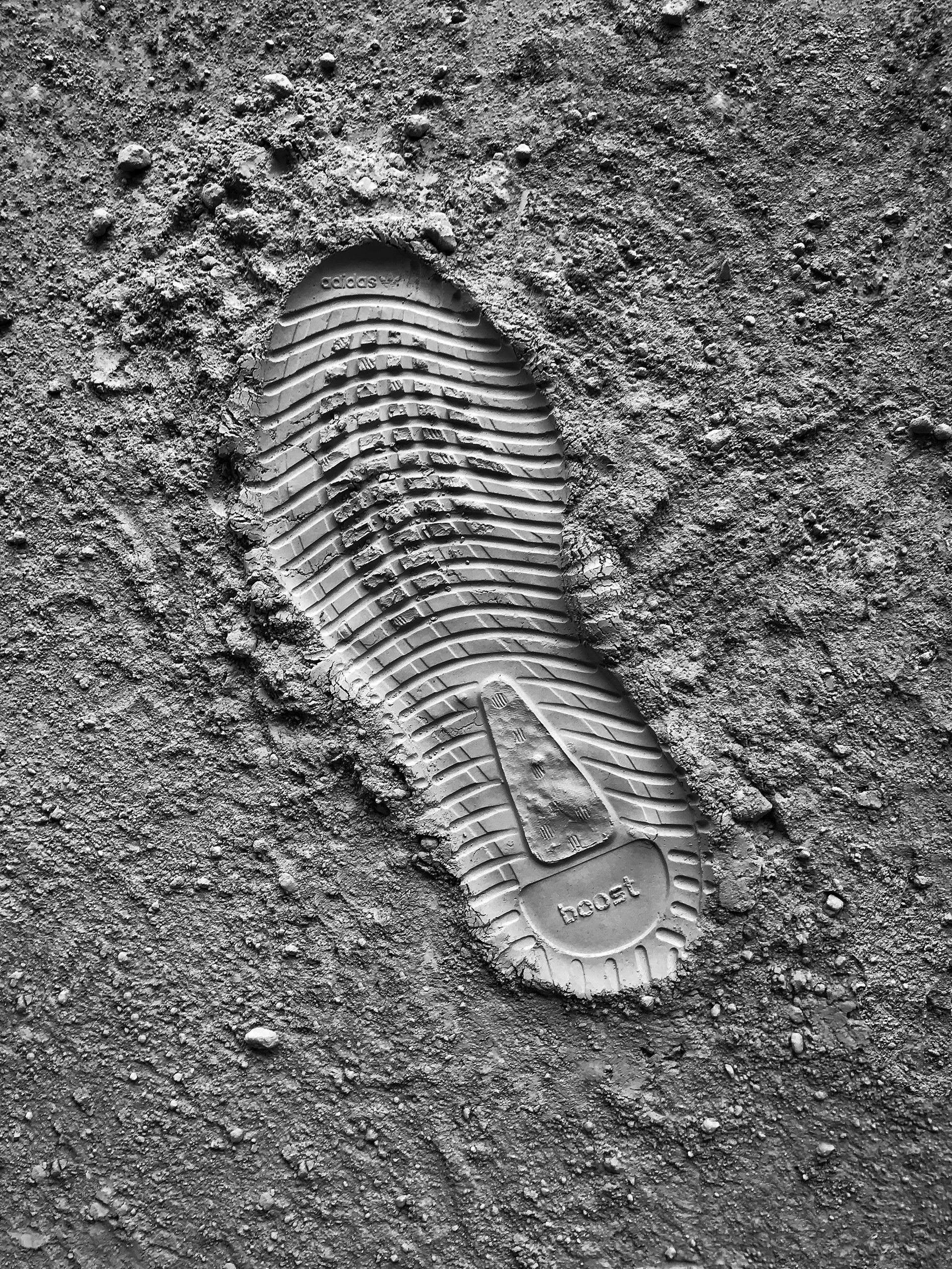
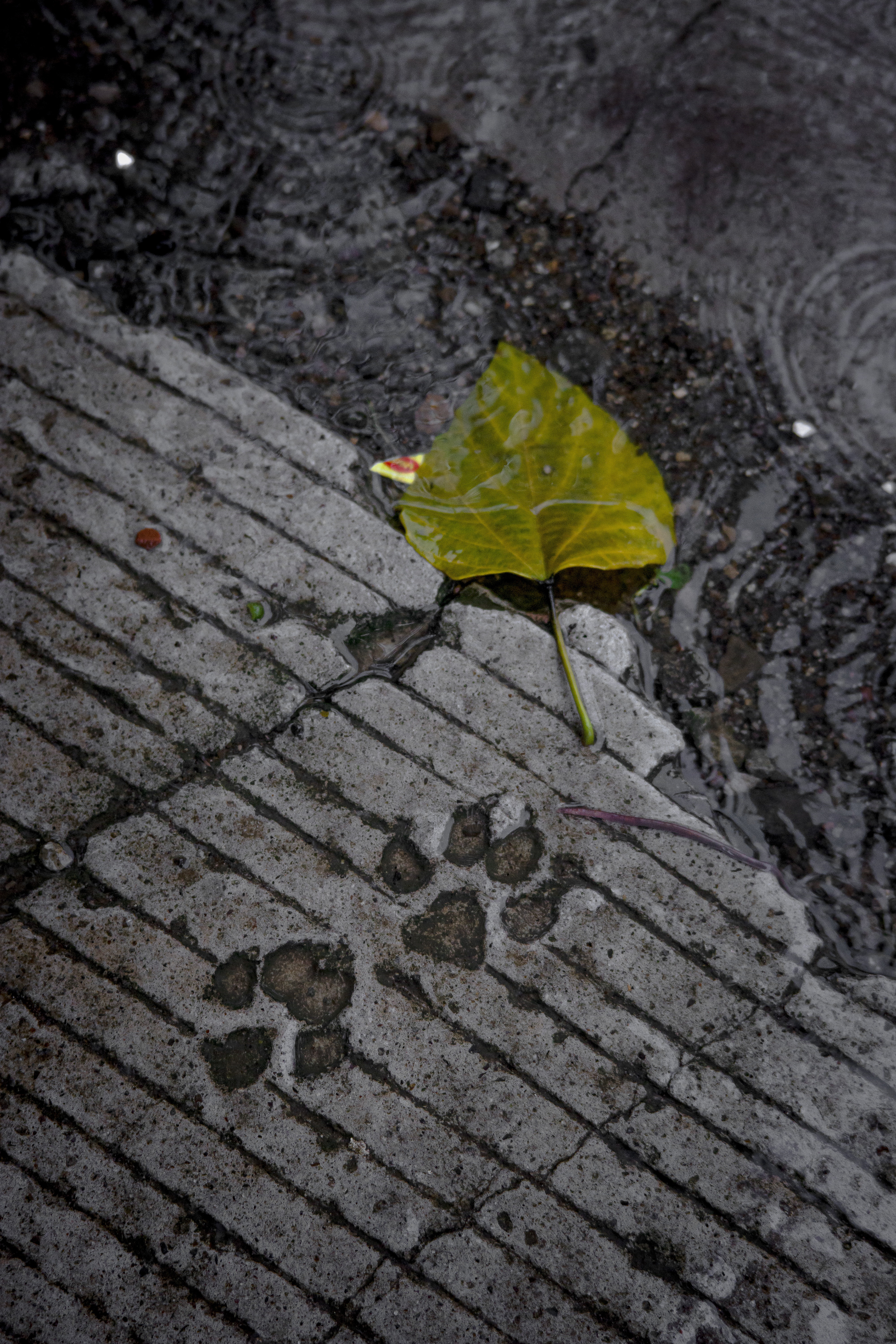
I made clipping masks on each image to isolate the prints and used the same Blending Mode and Layer Style as I did with the text. My biggest challenge was figuring out the scale and position of the print. I left the paw prints a little bigger because I thought any smaller would make the prints hard to make out. I spent awhile figuring out their positions. I wanted them to look natural but also feel right within the composition of the poster and eventually, I found something that worked.
This project taught me a lot about how to use Blending Modes to get elements to interact. In Photoshop, I was most familiar with how masks and filters can affect elements, so I am excited to incorporate the skills I have learned into future projects.